The Daily Click ::. News
 

Meet the new Daily Click!
News posted 8th February, 2011 by Flava  

So the countdown is over and we're now ready to show you what we've been working on! Before I reveal all the lovely details, I have a few words to say regarding the history and current status of The Daily Click. The DC has been around for a very long time - in fact apart from the odd new feature here and there it has largely remained the same for the last 9 years. It seems remarkable that the very first account was created way back on the 2nd of December in 2001.

Some would say that the site has aged well and it does indeed still serve it's purpose. But we've come to the point now were we feel it is time for the site to evolve and catch up to the rest of the web. Not only will this help to provide a better service to our current users, we feel it will also help attract brand new users - users who want to play games as well as develop them. It's also a great opportunity to start fresh. It gives us a chance to fix the problems that some would say have plagued the site for a while. But more importantly, we still want to keep that DC feel which has kept the majority of our users visiting for years.

Today we're announcing the next version of the DC. Clubsoft and myself have been working on this since September - along with the extremely helpful feedback from the rest of the admin team. There is still some work to be done, but we're very hopeful of releasing the new DC sometime this year.

One thing we're very serious about is getting your feedback. We plan to post regular news posts regarding the progress of the new DC, including screen-shots and new feature announcements. We hope you'll help us out in telling us what you think so that we can try and make this version the best it can possibly be. There may be disagreements along the way, but hopefully we can come to an agreement on what is best for the site and the community.

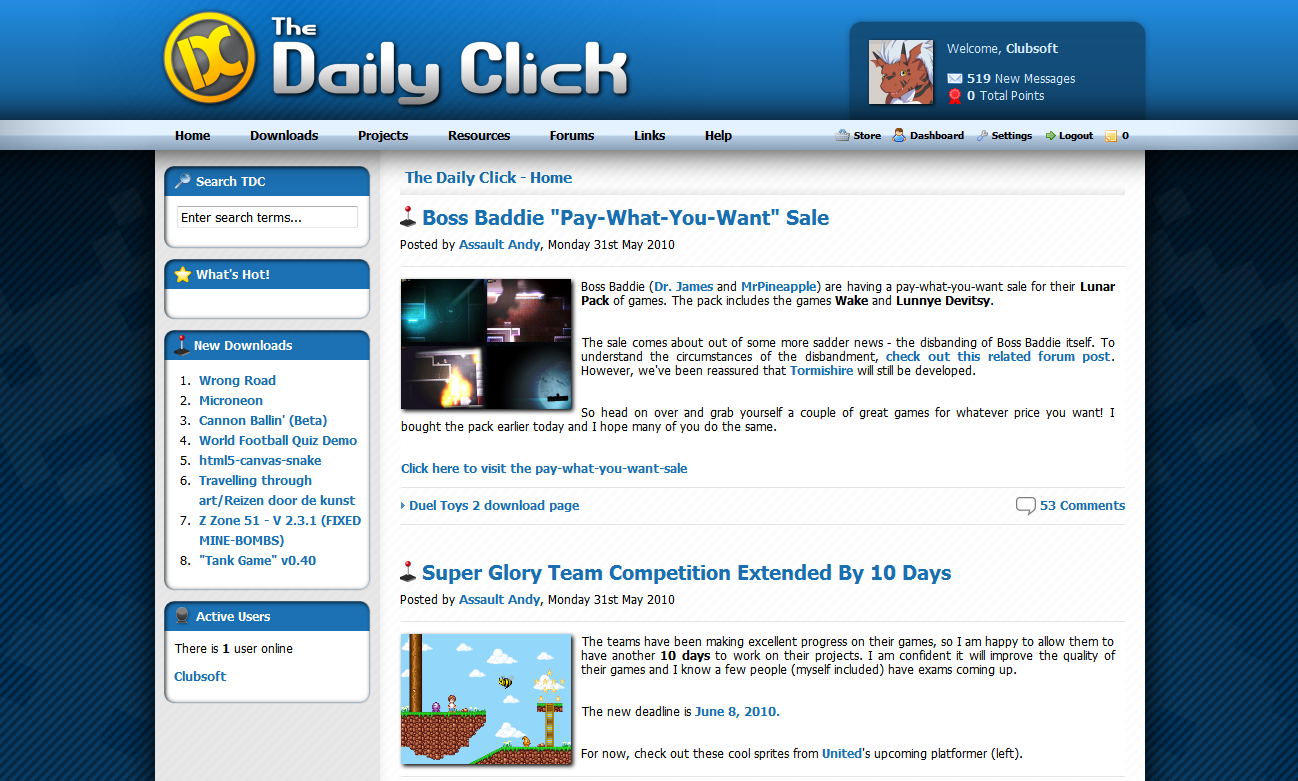
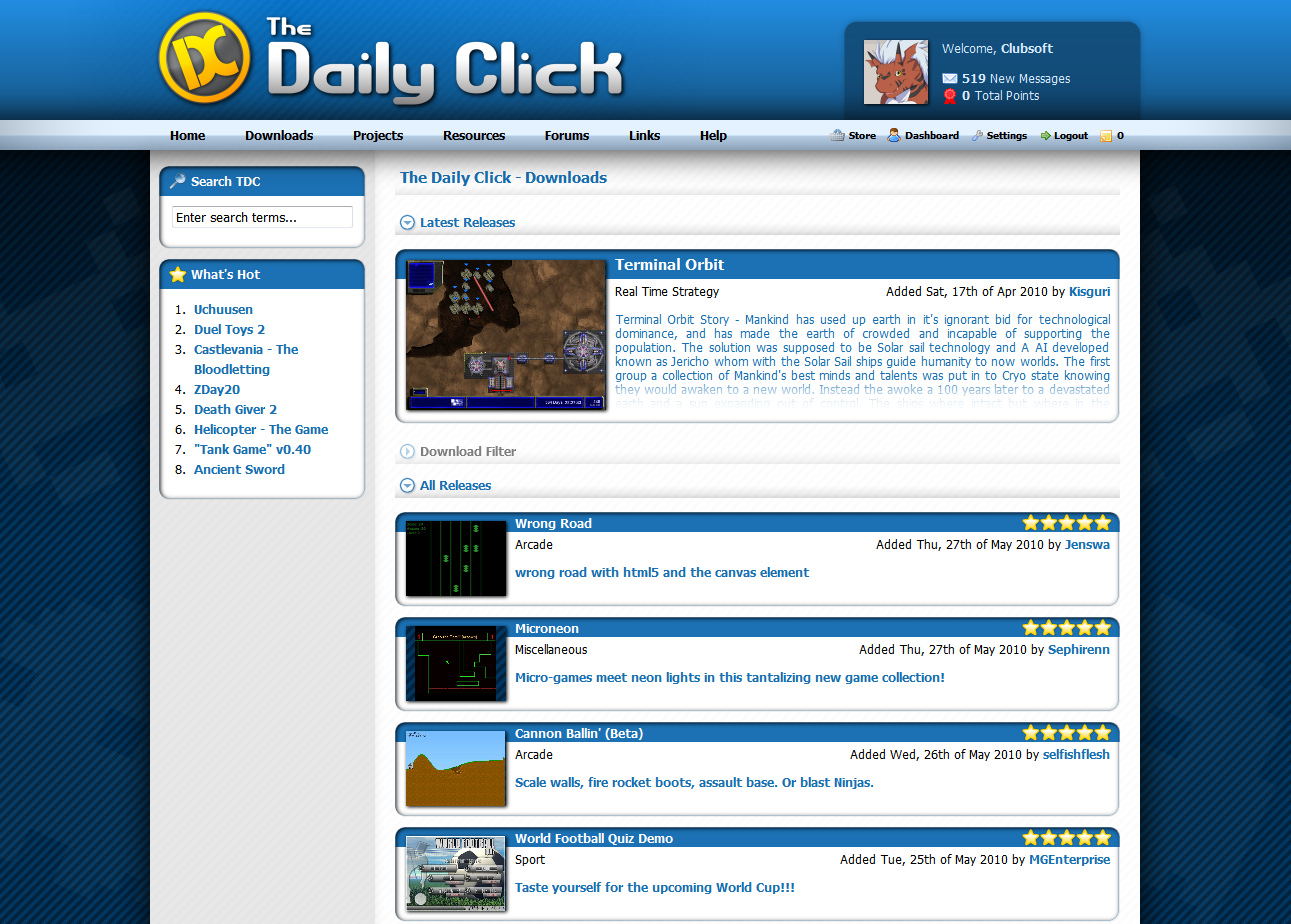
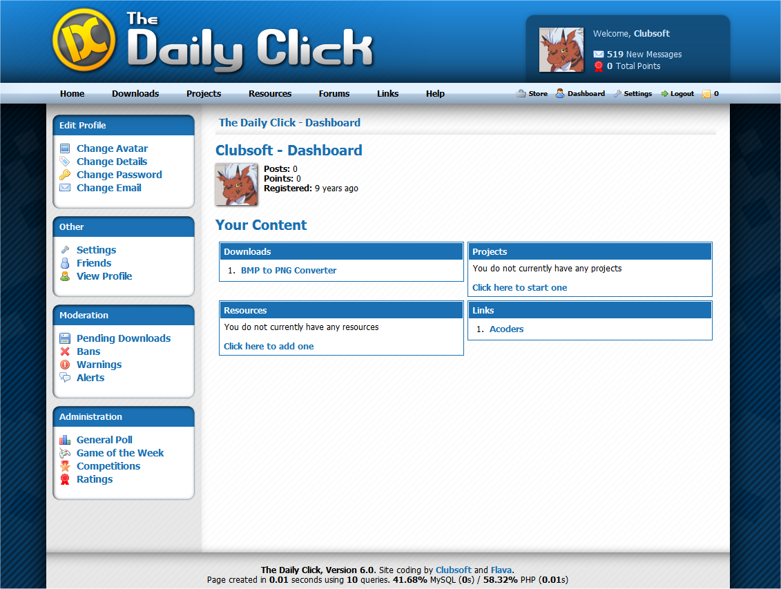
Okay, now for some important information. The new DC features a completely new re-design. We have a brand new logo which you can see above, and the design of the site fits in nicely with the rest of the web. Not only that, but we're now completely shifting over to PHP. We think this will probably make the site run a lot quicker and also make it less of a pain for us when developing new features!

   
Please note, these designs are not final and are likely to change according to your feedback!

We hope to tease you with more juicy details in the coming days - the next news post will cover the re-design and a brand new private messages system. I will also put a FAQs section in the next news post - so please post any questions or suggestions in the comments and I will try to answer the most important ones!


Posted by Jon Lambert 8th February, 2011

Boy am I glad I stayed up for this!
 
Posted by Silveraura 8th February, 2011

Well, the secrets finally out. Does that mean our secret forum is no longer secret?
 
Posted by Carnivorous id 8th February, 2011

Looks great! Love the new logo.
 
Posted by Blue66 8th February, 2011

That sounds great Rikus and I really like the new layout! One question, will the size of one page be smaller than 2megabyte this time? Because surfing TDC on my smartphone really sucks right now because of traffic limit after a while
 
Posted by Emomiilol 8th February, 2011

This looks great! The new logo and design is pretty awesome.
 
Posted by Hagar 8th February, 2011

Looking good
 
Posted by Liquixcat 8th February, 2011

I approve, and my approval is 99.95% necessary to your success. One piece of advice though: When I log in I don't want it to call me Flava, other than that great work
 
Posted by Deaval 8th February, 2011

Now that's fancy.
 
Posted by Flava 8th February, 2011

@RickyH - but that's the best feature!
 
Posted by Eternal Man [EE] 8th February, 2011

Looks awesome!
 
Posted by lembi2001 8th February, 2011

Wow, how long have i been away for?? The new design and logo both look really good. Can't wait to see what else you have in store for us.
 
Posted by aphant 8th February, 2011

It's a good new look, but how will it make TDC better?
 
Posted by Yai7 8th February, 2011

God bless you! You are not closing the website!
 
Posted by Flava 8th February, 2011

@aphant - I'll try to cover this in the next news post!
 
Posted by nim 8th February, 2011

Looks good, but I'm glad it's not just that. Nice work Flava/Clubby.
 
Posted by HitmanN 8th February, 2011

I like the overall design, but I'm not sure about the font. Maybe it's the screenshot, or the browser used in them or whatever, but the bolded fonts look bloated and the spacing between the fonts varies between 0-2 pixels. The text is kinda hard to read here and there.

Still, definitely a good direction overall.
 
Posted by Flava 8th February, 2011

Those issues are more likely to be with my browser and OS - I'm on Fedora. Will see if I can get some Windows/OS X screenshots and see if that is any better!
 
Posted by Duncan 8th February, 2011

Cool!

But are you porting any of the old content over? Obviously we can't just throw away 9 years of klik history...
 
Posted by Marko 8th February, 2011

Looking good
 
Posted by Hagar 8th February, 2011

I agree with Duncan, is the present database going to be floated across? Have you guys developed some kind of asp database (can not even think what it is called it has been that long since I used ASP) to mysql database converter?
Comment edited by Oddball Hagar on 2/8/2011
 
Posted by Flava 8th February, 2011

Most content will be carried over - things like downloads, projects, articles, forum posts .etc.

Other things we haven't decided on. For example, favourite projects may be replaced with a completely different system so those may not be carried over.

All the important stuff will be copied over though.
 
Posted by Ski 8th February, 2011

Its taken this long to get to 0 and all you can do is announce it?
 
Posted by Flava 8th February, 2011

It's not exactly a small job.. but yes!
 
Posted by Clubsoft 8th February, 2011

Updated to windows screen shots for the intended font, seem to have made flava dissapear too, sorry!
 
Posted by Ski 8th February, 2011

I like the overall layout, but really think there's potential to improve the title art.

There's already a lot of white,silver and blue in the design, I think it could use a splash of colour to make it less bland (the logo isnt enough IMHO).

The font used reminds me of the typical rounded fonts you see on free font websites, and to be honest, it doesn't look like as much thought went in to it as the layout or logo.
 
Posted by Flava 8th February, 2011

I think the font used is Tahoma - may be an idea to give Arial or Verdana a try?

I agree that a little more colour could be used in places though. Would be nice to get some more of the yellow somewhere I think (though design isn't a strong point of mine, so who knows). Will certainly give it a thought!
 
Posted by Clubsoft 8th February, 2011

Content will bring a lot more colour, there are a lot of blank areas yet to be put in

Icons need to be redone
 
Posted by HitmanN 8th February, 2011

How about in addition to project pages, members would have their own too, maybe a simple personal blog, similar to the devlogs. Sometimes it'd be easier to just follow and favorite a user whose production you fancy following, instead of all their projects individually. Then, whenever the favorited user updates their blog, or any of their game projects, the favoriter (is that a word?) would be informed of the update.

Perhaps it'd become more about people than games then, but I'd find it much easier to just be able to favorite someone and immediately get updates on all their production here on TDC, if I so want.
 
Posted by HitmanN 8th February, 2011

Flava:
I think TDC uses Tahoma currently, so I'm guessing it's just a browser specific thing. Arial or Verdana could work too though.
 
Posted by Flava 8th February, 2011

The current site actually uses Verdana (or Arial if you don't have it)
 
Posted by Pixelthief 8th February, 2011

Wasn't this website brand spanking new just the other day? Bah, time flies
 
Posted by s-m-r 8th February, 2011

It's clear a lot of thought has been put into the redesign of the site...Congrats on the unveiling!

Here's to another 9 years.
 
Posted by Duncan 8th February, 2011

Adam means the font that 'The Daily Click' is written in, distinct from the DC stamp.

Good to hear about content Flava!
 
Posted by Johnny Look 8th February, 2011

oh boy, I had a raging boner just by looking at those screenshots. Not exactly what I was expecting, this surpassed my expectations by a large stretch. Congratulations everyone involved !
 
Posted by Ski 8th February, 2011

Wow, you're easily pleased.
 
Posted by The Chris Street 8th February, 2011

The DC stamp was always part of the new logo, we dropped it into different avatar images to perhaps drop vague hints
 
Posted by Hagar 8th February, 2011

@Johnny Look: Steady on lad, and think of lancashire hot pot!

When can we expect to see the site go live?
 
Posted by Strife 8th February, 2011

I definitely approve of this upcoming redesign. I'm especially excited about the new PM system.

If I were to make a suggestion, I would recommend taking steps the integrate the site into popular social networks like Facebook, Twitter, etc. That way, it'll be easier for our Facebook buddies to keep track of our projects, to Like stuff posted on the site, etc. It's merely a suggestion of course, and regardless, I think the new additions are a step in the right direction.

I'm also not too sure about that new Download page. I like the current Downloads table in the sense that you can see a large number of downloads at once. On the other hand, the new page is easier on the eyes... Perhaps as a compromise, you could have an "Archive" section of some sort that uses the old-style table.
Comment edited by Strife on 2/8/2011
 
Posted by -Liam- 8th February, 2011

The links (Navigation bar) should use image flips and be in Helvetica Neue or Arial Rounded! The new design is looking great though! Image
Comment edited by -Liam- on 2/8/2011
 
Posted by Ski 8th February, 2011

"The DC stamp was always part of the new logo, we dropped it into different avatar images to perhaps drop vague hints "

Really? I never noticed.
Comment edited by -Adam- on 2/8/2011
 
Posted by AugustoAD 8th February, 2011

Wow boy! Looking good! Really Smooth, you should put it on right now!
 
Posted by Hayo 8th February, 2011

Nice to hear content will be shipped over. Can I also keep my fake accounts?
 
Posted by Ski 8th February, 2011

You will have to get rid of your Chris Street and Rikus accounts. You can still keep Hayo though
 
Posted by Hagar 8th February, 2011

LOL
 
Posted by Tropik 8th February, 2011

Million times better than current layout. :]
 
Posted by OMC 8th February, 2011

Nothing is final yet. The logo font could change! And I think skins are still going to be supported.

Not sure if anyone mentioned this, but there will be a project page for people to vote on stuff and give ideas.
 
Posted by MJK 8th February, 2011

Looks amazing! Looking forward to it.
 
Posted by The Chris Street 8th February, 2011

Har har Adam, you comedian.
 
Posted by Windybeard Games 8th February, 2011

Looks really good! congrats.
 
Posted by Ski 8th February, 2011

Well, we can all dream, Christopher.
 
Posted by Jason Orme 8th February, 2011

Like It!
 
Posted by Shiru 8th February, 2011

Awesome ^^ . You should do an app for Android/iPhone.
 
Posted by The Chris Street 8th February, 2011

Well, keep dreaming... um... Adamostopher
 
Posted by MasterM 8th February, 2011

53

already? wow
 
Posted by MasterM 8th February, 2011

oh also i dont want to be a party pooper and its nice and all that there is a new layout- great.

still could it be possible to keep the old layout?

KOTAKU.com just changed their layout and its awful. a lot of people are complaining and its full of white- it hurts my EYES!

now tdc changes their layout and once again its full of white. i don't like white. its painful to watch because its so bright.

i am using the dark blue skin and i just love it. i feel welcome with it.

if it WONT be possible to stick to the old version if a user prefers to could it at least be possible to change colours / provide certain skins?

thanks a lot
 
Posted by OMC 8th February, 2011

Skins, yep!

(I also dislike Kotaku's new site.)
 
Posted by Clubsoft 8th February, 2011

The entire site is CSS layout, no more damn tables, so it'd be quite possible to create a "classic" inspired skin, along with a number of other quite radically different designs and layouts.
 
Posted by Marko 8th February, 2011

Forum for ideas/suggestions is a great idea
 
Posted by SortaCore 9th February, 2011

wow Clubsoft has gotten popular... how many messages do those screenshots show?
 
Posted by W3R3W00F 9th February, 2011

Excellent! I like all of those layouts, but mostly the first. It just looks right.

Now TDC will match the updated look of the arcade.
 
Posted by -Liam- 9th February, 2011

Yes, please manufacture an iPhone app for TDC. This behaviour is an absolute necessity, I'm afraid. I can accept nothing less ;_;
 
Posted by Flava 9th February, 2011

If you want to buy me a Mac and an Apple developer license, feel free
 
Posted by Hagar 9th February, 2011

Awesome work dudes , I approve of the positive waves

On a side note : I am starting to feel like a grumpy old man, why do people feel the need to check things on their phones? Surely its not too much to wait until you get to an available PC ? I see "facebook" phone zombies on the way home from work, slowly staggering along the road and sometimes just randomly stopping and I just think what the...?
 
Posted by OMC 9th February, 2011

You know, I thought the exact same thing, Hagar. But my brother convinced me to get a phone and it is pretty handy to check things really quick when I'm out and about.

But I have to promise myself not to use it as an excuse to not talk to people.

I'd love an Android TDC App.
 
Posted by Marko 9th February, 2011

Ha, i think the older folk thought the same about us when we were stuck in at home, faced glued on the t.v. whilst playing our Mega Drives
 
Posted by Yai7 9th February, 2011

No!!! My Maybe Skin!!! It will be taken away!!!
 
Posted by Ski 9th February, 2011

I actually think the rounded look is old now.
 
Posted by Roncho 9th February, 2011

It looks slick actually!
 
Posted by Hagar 9th February, 2011

I kind of agree Marko and OMC, but I did not walk down the street playing my SNES hardly aware of the world around me...

Also I have the most awesome post number .
Comment edited by Oddball Hagar on 2/9/2011
 
Posted by Jacob! 9th February, 2011

Agree with Adam; while this may look good to some people it is certainly not timeless. It makes far too much use of glossiness and shadows and gradients.
 
Posted by OMC 9th February, 2011

That's what skins are for.

Hagar, guess that's a good use of the word zombie. Having a phone to check things on doesn't require that you be a zombie though. (Even if it seems to be pretty common.)
 
Posted by Marko 9th February, 2011

@Hager - you should've tried playing your SNES whilst walking down a street, you'd have had even weirder looks than the facebook/phone kids of today lol
 
Posted by Flava 10th February, 2011

The site will still have a skins system, so if you don't like the one above you can change it to one you prefer.

As Clubby pointed out, the new skins system will be far less restricted than the current one. Skins could actually make the site look completely different.
 
Posted by Silveraura 10th February, 2011

In fact, I'm already beginning to throw together some concept designs for a few new skins. Once I have the necessary files and foundation, I'll start working on putting together a few wide variety skins to cover various tastes. One of which will be similar to the one I made for the current version of TDC.
That way when the new site is open, no one is stuck with a single theme.Keep an eye on the project page for more details.

I wont do this completely on my own taste though, please send me messages giving me ideas on themes or styles you'd like to see.
 
Posted by Hagar 10th February, 2011

Would be quite funny, I could push a trolley with a car battery, inverter (to get mains) and a SNES/Portable CRT TV (Playing a SNES on a LCD TV is just wrong).

Now that IS portable gaming haha!

Anyway back on topic, I miss the orange theme which this site used to have when I first joined...
 
Posted by Flava 10th February, 2011

The orange skin is still there
 
Posted by Hagar 10th February, 2011

So it is , hmm I am sure the title was different but it was a long time ago...
Comment edited by Oddball Hagar on 2/10/2011
 
Posted by Ski 10th February, 2011

I think it should be open to the community to make skins like before. Otherwise we're going to end up with ugly Vista fan skins.
 
Posted by Jon Lambert 10th February, 2011

You'll all be able to make your own skins like before. I don't think we'll limit it to particular skin-making competitions like before, or in other words, the link to the template package will be more easily accessible than before. I don't know if such a package is ready yet though.
 
Posted by Silveraura 10th February, 2011

Really Adam? 8 comments and 7 of them are either negative and/or smart-ass jabs. Have you nothing better to do then to try to start a fight? Just take a step back and look at how childish you're acting right now. That's all I'm going to say.
 
Posted by Ski 10th February, 2011

Im just a bit confused, Brandon. You seem to be taking charge of the whole skin design thing, yet Flava tells me you're not
 
Posted by The Chris Street 10th February, 2011

Brandon offered to make some skins, he has not taken charge of anything.

If you fancy making a skin when the site is done, go right ahead.

Please try and stop being so negative about everything and cheer up
 
Posted by Ski 10th February, 2011

If negative is now the term for constructive in the playground, then I guess you guys would be right. But you're not.

I said I like the layout, but the title art looks like a common free rounded font and the rounded look on the boxes is old. If you can't handle that then its your own petty problem.

But it is a shame you guys couldn't have the site ready for the 0 like you were supposed to originally
 
Posted by The Chris Street 10th February, 2011

I know some of your comments were constructive, but they were said in a sort of negative way. I'm not just talking about the announcement of the new TDC either, but in general. You do keep saying that I'm quite petty, or have petty elements, but thats not really the case. We can handle the criticism if its constructive, that's why we're wanting to make this everyones community site and take everyones comments on board.

And yeah, I do agree that its a shame the site couldn't be ready on time, but we under-estimated how much work we needed to do on it.
 
Posted by Jon Lambert 10th February, 2011

What else was underestimated was the amount of conflicts the coders would experience, in terms of Flava having internet troubles and Clubsoft having to travel to the United States, and such things as that.
 
Posted by Ski 10th February, 2011

You are petty. You even admitted in a pm that silencing me was because of your own personal issues and that you were wrong. Dogzer recieved warnings because you couldnt ignore his moaning about deleting his story, which to be fair, wasn't that bad in the end.

And to top it off, you're notorious for having the last say before you lock threads, or unlocking threads Rikus has locked to have your last say. Ive seen it done so many times. If that isn't petty, then god knows what is.
 
Posted by The Chris Street 10th February, 2011

In the PM I apologised for silencing you, and that I went the wrong way about it. This was my (probably futile) attempt at melting the ice. There was no mention of my "personal issues" so don't embellish the truth.

Dogzer received only one warning from me, because yes, it was tiring to see him mention it all over TDC, and I did ask him to stop but he chose to ignore me. The other admins were tired of it too and felt a warning was appropriate.

I also lock threads because that is what I'm supposed to do when an admin feels a conflict is getting out of hand. I post a warning threatening to lock the thread first, and if issues continue then its locked. All admins do this.

Anyway:
Image
 
Posted by The Chris Street 10th February, 2011

Besides I want to sort of extend an olive branch to you, but I just have this feeling you won't take it.
 
Posted by Silveraura 10th February, 2011

I said 7 out of 8 of your comments were negative. That left ONE of your comments as being constructive, so don't try to make it seem like I wasn't giving you any credit.

With the way you're acting, Adam. I think you're just jealous that I have a small part in the new version of the site, albeit accidental. I never claimed to lead in any part of the site, I was kindly stating that I would be creating skins for the site and asked for ideas. You're the one who purposely took it the wrong way. You asked Flava? Really? I rest my case.

The very way you're acting about this is making you look very childish, not constructive. If your intent is to be constructive, here me out when I say that you're doing a horrible job. Theres some respectful, constructive feedback for you, Adam.
 
Posted by Ski 11th February, 2011


Honestly, I couldnt give a crap who has a part in the new site, Brandon. So long as Clubsoft and Flava are coding it, that's all that matters in the long run.

Your tone was suggestive that you were in charge of skins for TDC, asking people what they wanted, hence my request that other users could make skins too.

As for accusing me of acting childish, Im not going to deny that. I can be incredibly childish.

But I think you perhaps forgot about a couple of weeks ago when you went on a little spamming spree in two news posts with "lol" in the middle of a flame war. No doubt trying to provoke a reaction from somebody like you so often do.

http://create-games.com//newspage.asp?id=3757
http://www.jonhlambert.com/The%20Daily%20Click%20-%20News.htm

Oh yeah, and then there was the time I was silenced and you were the only person to show yourself up by taking the opportunity to bitch about me... and you think Im worried how I look?

A couple of months ago you made some silly post about no longer arguing with me. A week later you make a bitchy little swipe at me and wonder why I react the way I do?

So yes, carry on being a hypocrite, see where it gets you.
 
Posted by The Chris Street 11th February, 2011

Eeek ok guys, lets get this back onto the topic
 
Posted by Hagar 11th February, 2011

TBH dudes I do not like the font very much. Not too sure why, but it just does not appeal to me. When I did my graphics module I found making my own fonts in Illustrator really quite ace...

On a side note I do think anyone that cussed Adam whilst he was silenced was being out of order, but anyway here is something appropiate http://www.youtube.com/watch?v=J7ErrZ-ipoE. Anyway I suggest everyone has a nice cup of tea and a biscuit , make mine a bourbon biscuit and a blue riband!
 
Posted by The Chris Street 11th February, 2011

I find making my own fonts quite difficult... I have a very limited imagination

I guess we can look into the possibility of a new font but I suspect the colouring would stay the same at least. I'll let you know if we come up with anything, or if anything should change, but in the meantime feel free to show us your own ideas
 
Posted by Marko 11th February, 2011

Why not have a compo for a Daily Click font set or a logo-compo?
 
Posted by Ski 11th February, 2011

I don't mind the logo Infact, it would have been nice for the title art to have the same font used in the logo.
 
Posted by Marko 11th February, 2011

I also don't mind the logo but others seem to.
 
Posted by The Chris Street 11th February, 2011

Well, we definitely want to keep the DC stamp, that will always be a part of the logo. I'm not sure a logo competition would be necessary at this stage, but we're always open to suggested designs
 
Posted by OMC 11th February, 2011

Hmmm, I need to take a crack at it.

If anyone else does, send it in!
Comment edited by OldManClayton on 2/11/2011
 
Posted by Rikus 11th February, 2011

I think the tdc stamp should be blueish instead of greyish like in my avatar And for a skin I still pretty much prefer the orange going to yellow for the title letter colors: The Daily Click.. then again I am a sucker for blue and yellow/orange as some of the oldbies of the site know
 
Posted by Jacob! 11th February, 2011

Until someone decides to fix the TDC logo, you can use this one I quickly made up
http://darkesoft.com/!/tdcnewlogo.png
Or you can just keep it, if you don't feel like making a better one.
 
Posted by Marko 11th February, 2011

Not sure about the font (looks too similar to Arial or something similar, i reckon), i love the colours and shading however!
 
Posted by OMC 11th February, 2011

It's pretty glossy. ;P Stick it on the pile!
 
Posted by Jacob! 11th February, 2011

It's Segoe Black, but since I have the psd, I can change the font if you like n_u
 
Posted by Rikus 12th February, 2011

I like it Jacob! Can you do the same one with the same blue logo but with a Orange/yellow colors to it for the daily click letters?
 
Posted by Jacob! 12th February, 2011

http://ftp.jacobpariseau.com/tdcnewlogo.png here you go Image
Comment edited by Jacob! on 2/12/2011
 
Posted by Jacob! 12th February, 2011

Also, one thing that always bugs me:
The date at the top right of a post is left aligned to a smaller div, or similar. Either right align it or make it say 'Today at 13:45' or something like that
Currently it looks like it's missing text
 
Posted by MGEnterprise 21st February, 2011

looks amazing plus my game is there kool, looks wicked.....keep up the good work .....


Author Info

Advertisement

Worth A Click