The Daily Click ::. Projects ::. Baby Ghost
 

Project: Baby Ghost
Project Started: 16th July, 2008 Last Update: 5th April, 2009
Project Owner: Jon Lambert Project Members:
Project Type: Ghostly Platformer Adventure Project Progress:
More Info: http://jonhlamb.googlepages.com/babyghostminisite Faves: 4

Hiding in the Shadows, Reworking the Game
Posted 5th Apr 09, by Jon Lambert  
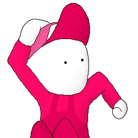
Okay, so secretly, I've always had a desire to make the graphics in this game bigger, but I still like the small style, so I was going to make this one small and the sequel big (graphics-wise). But too many people have complained for me to be satisfied about this decision, so I'm making them bigger. 4x bigger. The first picture is an example of the original graphics at 4x resolution (except the grass for reasons which will be obvious when you see the new graphics) and the second picture is a sample of the new graphics. I'm not done with all of them yet. Please comment on these graphics.

HIGH-RESOLUTION BABY!!!

I'm not done making Pak (the main character, otherwise known as Baby Ghost) and I'm going to have to remake the engine. With these new graphics, however, I'll be able to make some new stuff. The first thing is Pak's eyes; Pak will look around at his surroundings and interesting things you might not normally notice, similar to Wind Waker.

Bump down to 1% progress.
Preview

Preview


Posted by Jon C-B 5th April, 2009

In someways high res looks a lot better, but in other ways the old kind is best.
 
Posted by Jon Lambert 5th April, 2009

Elaborate please? Which parts are bad? Is it the ectoplasm, or the bush, or what? If it is the bush, then I'm not done with that, and if it's the ectoplasm, that's a shallow pool, and I'm thinking of changing it so it only ripples when you jump in. The tombstone I don't really know what to do, except to make it look old and cracked. Don't know what to do about the grass. The tiles for the tomb are clashy, I guess.

More specific please?
 
Posted by Sketchy 5th April, 2009

You haven't really used the high-res properly. It's like you just enlarged everything and smoothed the jagged edges, but haven't actually added any detail (certainly nowhere even remotely near to enough).

It's like the difference between a profesional looking NES game, and an amateurish looking flash game.
I think you're much better off going for the retro look personally.
 
Posted by Jon Lambert 5th April, 2009

That does make making the game easier, but now I've learned nothing from this...

Which ones have no added detail? I wasn't done...
 
Posted by Dr. James MD 5th April, 2009

I prefer the low res style. there isn't much gained from the higher resolution in that screenshot.


Project Forums


Favourite

Advertisement

Worth A Click