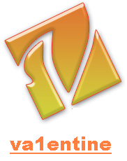
Chaoz, the V is a bit wierd but I like the rounded square with the website address.
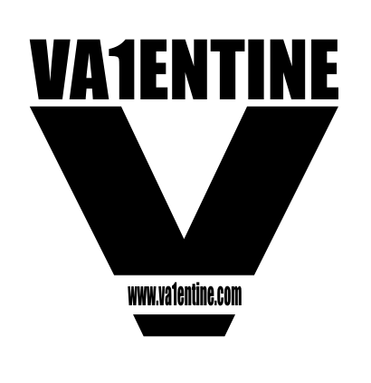
Dines, interesting but the website address looks very squashed horizontally.
Nope not forgotten, playing to much Gears of war 2 is the problem... well that and a full time job! Some great response's to my add and i have some favorites. Not seen one i'd like to change my logo too unfortunately though! Still this just shows TDC has a very creative community and i never want to see this site disapear! I'll definitely be making another donation to the site soon!!!!!
PS: If anyone still wants to design a logo and i use it my offer still stands!!!!!!!
(by the way, black backround and blue logo and white writeing is what i'm looking for )

 Advertisement


 Edited by alastair john jack


 )
)