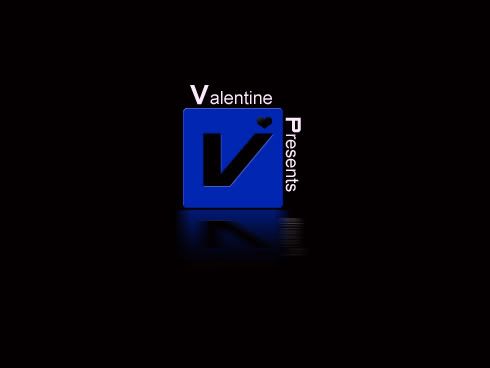
Oi, I hate my computer. I made a new text... it honestly doesn't look so good but I accidentally finalized it before I was done. Then my ancient computer froze and I sat here for ages trying to get it to come back on.
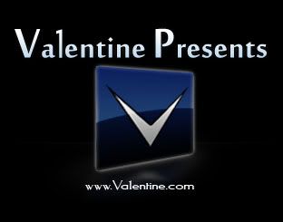
It's the same URL so the one above will be changed too.
I'm goin' back in. >:| Wish me luck. (Hopefully I'll be bearing presents on my return.)
Dr. James, what the hell is Factor 5? I've never heard of it but it sounds like a Sci-fi show of some kind (i'm resisting Wiki'ing it because i'd rather hear what you think of it, if it's a show!) And -Adam-, yeah i see what you mean though it was unintentional. Kinda looks like a Citroen logo too, now i think about it...
Thanx I just read about Factor 5, didn't realise they made so many great games, especially the Rogue Squadron games for the N64/Gamecube. I've even got the first one on N64 but still didn't realise!
Back on topic...... i have nothing else to say now.
Factor 5 used to be a Nintendo 2nd party developer once upon a time. Made middleware for Nintendo's consoles. I think they're close to going under now, if I remember right.
Anyway, I've decided that I don't want to put up with my computer's slowage at the moment, so the one above will have to do until I get enough patience to try again.
I shall now eat an apple turnover and drink some coffee.
EDIT: How come the two graphics are different? O_o They're the same URL.
Oh, also, I wasn't aiming for a floppy look... It's supposed to be sort of 3D looking but without a visible edge on one side. It would work as a floppy shape except that the left side's angle would be off a bit.
I'm not keen on the font of your new one OMC. When it comes to logos you need something quick to read. Block colours or soft gradients, no outlines (unless its against a certain type of background) and all that.
^ reminds me of Rockstar Leeds logo. Or the one they use on the LCS and VCS games anyroad.
Originally Posted by Dr. James I'm not keen on the font of your new one OMC. When it comes to logos you need something quick to read. Block colours or soft gradients, no outlines (unless its against a certain type of background) and all that.
^ reminds me of Rockstar Leeds logo. Or the one they use on the LCS and VCS games anyroad.
Well, I can get rid of that effect. What do you think of the font itself? Think I should keep it?
It's hard to say, but I'd be inclined to say change it. Given that "Valentine Presents" takes up quite a bit of space you don't want a font that's too thin or cluttered.
Also a good logo needs to work on any kind of background with only the simpliest of colour changes.

 Advertisement


 Edited by Dr. James MD


 Then my ancient computer froze and I sat here for ages trying to get it to come back on.


 I just read about Factor 5, didn't realise they made so many great games, especially the Rogue Squadron games for the N64/Gamecube. I've even got the first one on N64 but still didn't realise!
 I wasn't aiming for a floppy look... It's supposed to be sort of 3D looking but without a visible edge on one side. It would work as a floppy shape except that the left side's angle would be off a bit.


 Well, I can get rid of that effect.
