Originally Posted by Dr. James Also a good logo needs to work on any kind of background with only the simpliest of colour changes.
It also needs to be easy to print. BrandonC's first logo and Klikmaster's logo both look nice, but no one would want to print it. They'd be more suited to things that would stay 2D and virtual, like installers or desktop icons.
^
As always! But will Valentine be printing these? A lot of them here would be too dark to print.
The most recogniseable logos are always paired with a monochrome version too. Usually.
Originally Posted by -Adam- Hmmm... let's see... "Valentine presents"- I wonder if he's printing them, or using them at the start of his game?
Hmmm... let's see... Cut out "Va1entine presents" and you could have a logo that you can put anywhere. How many of these designs would work without it?
Va1entine, before you choose a design, I have about 6 that I made in my Theory of Knowledge class this morning. They're only on paper and I'm in school right now, so I can't draw them on the computer just yet. That will be about 8:00 tonight, since I have to go to work today. So please hold off until then.
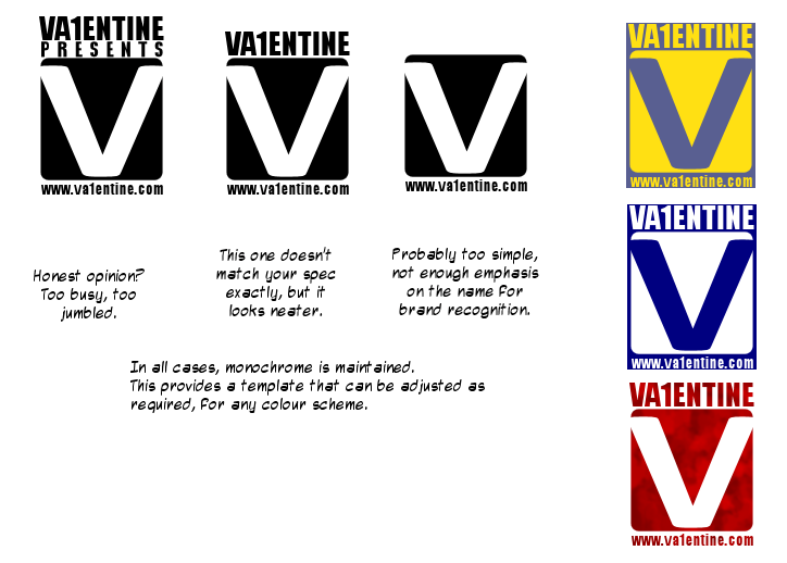
The top three are variations on the same theme, and I would recommend the middle one. The other two just show how it can be altered if needs be.
It is monochrome, which maximises its versatility as shown on the examples to the right. You can change it to fit almost any colour scheme, meaning you don't have to worry if your games wildly differ in tone or theme, or if you change your site design. You can also enhance the logo to fit with every game, as its shape is easily recognisable (e.g. make it drip with blood in a horror game, make it out of stone in a caveman game, etc).
And if you ever did go professional, the monochrome base will print out perfectly on any B/W Laser Printer.
Love the designs, especially the colour schemes you've picked. I also like the way they remind me of some kind of record label - very professional looking indeed!

 Advertisement


 Edited by Ski