The Daily Click ::. Forums ::. Digital Works ::. My next game, some mockups and ideas
 

Post Reply  Post Oekaki 
 

Posted By Message

alastair john jack

BANNED

Registered
  01/10/2004
Points
  294

GOTW WINNER CUP 1!GOTW WINNER CUP 2!GOTW WINNER CUP 3!VIP MemberMushroomI am an April Fool
31st July, 2009 at 03:57:20 -

this is pretty cool so far, I really liked the music too. Looking forward to hearing some sound effects too!
You do have some troubles with shading on the turnip though, I think the shading should demonstrate the form more - not the edge.
just a quick edit to show what I mean: Image

 
lol

UrbanMonk

BRING BACK MITCH

Registered
  07/07/2008
Points
  49567

Has Donated, Thank You!Little Pirate!ARGH SignKliktober Special Award TagPicture Me This Round 33 Winner!The Outlaw!VIP MemberHasslevania 2!I am an April FoolKitty
Picture Me This Round 32 Winner!Picture Me This Round 42 Winner!Picture Me This Round 44 Winner!Picture Me This Round 53 Winner!
31st July, 2009 at 22:14:07 -

very cool. Make a project page for this!

 
n/a

Klayman


Registered
  10/08/2002
Points
  138

MushroomVIP MemberI am an April Fool
3rd August, 2009 at 22:33:43 -

UrbanMonk, as per your suggestion the project page is officially up.

I also made a updated demo and linked to it on the project page.

Alastair, thanks for your advice. Hope you don't mind if I use your version of the turnip. Let me know what you think of the shading in the new demo, i'm trying to improve my techniques.


Klayman (AKA Steve)
I also make t-shirts: http://www.robitstudios.com/

Klayman


Registered
  10/08/2002
Points
  138

MushroomVIP MemberI am an April Fool
28th August, 2009 at 03:12:40 -

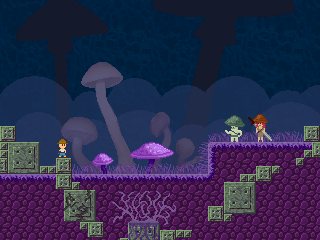
I sent the first beta of Karma to a few people for testing, so in the mean-time I worked on some tiles for my next game. I'm going to go for a more surreal atmosphere than in Karma and one of the first ideas that came to mind was this:

Image

What do you think? Any suggestions on colors or anything else? I have a hard time determining which colors go well together.

 
Klayman (AKA Steve)
I also make t-shirts: http://www.robitstudios.com/

erghhhhx


Registered
  15/11/2007
Points
  311

Mushroom
28th August, 2009 at 05:31:43 -

Ahh, that last pic gives me a hardon.. Awesome job.

 
n/a

alastair john jack

BANNED

Registered
  01/10/2004
Points
  294

GOTW WINNER CUP 1!GOTW WINNER CUP 2!GOTW WINNER CUP 3!VIP MemberMushroomI am an April Fool
28th August, 2009 at 08:06:37 -

looking hot, I don't really like those blocks though (all the cavestorylikes do it) but thats just me.

 
lol

Ski

TDC is my stress ball

Registered
  13/03/2005
Points
  10130

GOTW WINNER CUP 1!GOTW WINNER CUP 2!GOTW WINNER CUP 3!KlikCast HelperVIP MemberWii OwnerStrawberryPicture Me This Round 28 Winner!PS3 OwnerI am an April Fool
Candy Cane
28th August, 2009 at 15:27:48 -

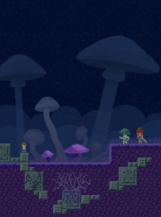
It's quite knytt/cavestory. I'm not so keen on the light mushrooms then the dark background. I'd make the huge mushrooms darker than the blue background

 
n/a

Klayman


Registered
  10/08/2002
Points
  138

MushroomVIP MemberI am an April Fool
28th August, 2009 at 17:22:41 -

Mother:

Alastair: Thanks. The block thing is def. a cavestory rip off, but this is how I work. I start with something I'm familiar with and then find a way to make it unique. I'll probably end up using the blocks in a different context when I'm designing the game though.

Adam: How this look? I agree that they need to blend it a little more.

Image


Edited by Klayman

 
Klayman (AKA Steve)
I also make t-shirts: http://www.robitstudios.com/

Lazernaut


Registered
  08/09/2002
Points
  1103

VIP MemberThe Cake is a LieIt's-a me, Mario!Wii OwnerPokemon Ball!
28th August, 2009 at 17:32:00 -

You've sold me! I demand you finish and release this game NWO!

 
n/a

AndyUK

Mascot Maniac

Registered
  01/08/2002
Points
  14586

Game of the Week WinnerSecond GOTW AwardHas Donated, Thank You!VIP Member
28th August, 2009 at 18:10:29 -


Originally Posted by Klayman
Mother:

Alastair: Thanks. The block thing is def. a cavestory rip off, but this is how I work. I start with something I'm familiar with and then find a way to make it unique. I'll probably end up using the blocks in a different context when I'm designing the game though.

Adam: How this look? I agree that they need to blend it a little more.

Image


I don't see why those large mushrooms are silhouettes. They don't really look that far away, and even if they were really far away but just incredibly huge you would be able to see some shape.

Everything since 2004 with square tiles will look like cave story. Don't worry about it.

 
.

Ski

TDC is my stress ball

Registered
  13/03/2005
Points
  10130

GOTW WINNER CUP 1!GOTW WINNER CUP 2!GOTW WINNER CUP 3!KlikCast HelperVIP MemberWii OwnerStrawberryPicture Me This Round 28 Winner!PS3 OwnerI am an April Fool
Candy Cane
28th August, 2009 at 18:30:37 -

You could perhaps try putting something between the huge mushrooms and the foreground, to suggest they're far awayish. Perhaps a layer of mist or trees. Pixel, mind. Don't use photoshop again

 
n/a

Klayman


Registered
  10/08/2002
Points
  138

MushroomVIP MemberI am an April Fool
28th August, 2009 at 19:56:17 -

Andy: You would be correct in assuming that I was too lazy to put detail into the large mushrooms. I wanted to convey the idea that they were in the distance and HUGEMONGOUS!

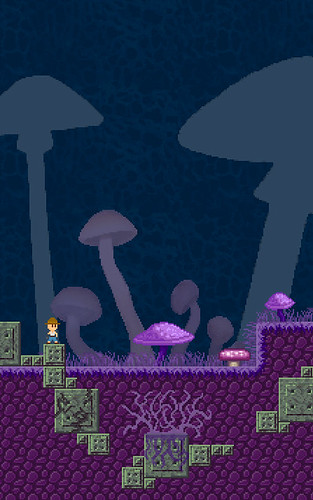
Adam: I tried some misty clouds, and I think it's better. I'll try some other things as well.

Here's an up-dated shot, now with MUSHROOM PEOPLE!

Image

 
Klayman (AKA Steve)
I also make t-shirts: http://www.robitstudios.com/

Marko

I like you You like you

Registered
  08/05/2008
Points
  2804

Has Donated, Thank You!Game of the Week WinnerVIP Member360 OwnerDos Rules!Happy FellahCrazy EvilI am an April FoolGingerbread House
28th August, 2009 at 19:59:38 -

Hmmm, i'm not a big fan of those mushrooms now they are so dark - before they looked like they were just slightly further back and clouded by mist/fog/smog, which i though looked better. Now the darkness of the bigger ones contrasts too much with the other kind, and it kinda doesn't make (visual) sense to me. The cloudy mist makes it look better, but i think i still prefer the lighter shade.

Looks f***ing awesome, by the way! I hope it's finished tomorrow so i can play it!!!

 
Image

Subliminal Dreams. . ., daily gaming news and the home of Mooneyman Studios!
www.mooneyman-studios.webs.com

Ski

TDC is my stress ball

Registered
  13/03/2005
Points
  10130

GOTW WINNER CUP 1!GOTW WINNER CUP 2!GOTW WINNER CUP 3!KlikCast HelperVIP MemberWii OwnerStrawberryPicture Me This Round 28 Winner!PS3 OwnerI am an April Fool
Candy Cane
28th August, 2009 at 20:08:43 -

Get rid of the pattern on the background. The mushrooms are silhouettes, and we can't see their details, so why would we see any details beyond those?

 
n/a

Klayman


Registered
  10/08/2002
Points
  138

MushroomVIP MemberI am an April Fool
28th August, 2009 at 21:08:18 -

Ok, it's looking a lot better now. This is why I love daily click! All your honest advice helps me more than you know

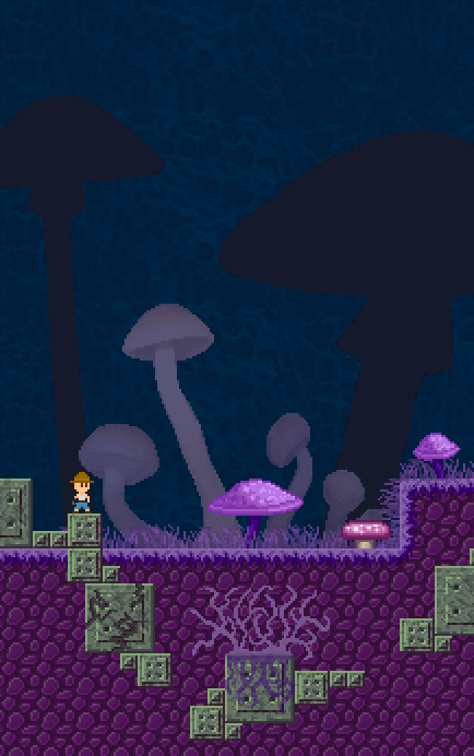
Adam: How's the detail on those now? Doesit looks ok with the different background? I took the old background pattern and made it very translucent and layered it over top the entire frame. I think that when it's all scrolling it will have a neat effect.

Marko: I agreed with what you said too, so i went somewhere between the light and dark mushrooms. Much better.

Image

 
Klayman (AKA Steve)
I also make t-shirts: http://www.robitstudios.com/
   

Post Reply


Advertisement

Worth A Click