The Daily Click ::. News
 

Site News: Upgraded Download Page & Article & Active Page!
News posted 17th January, 2009 by Rikus  
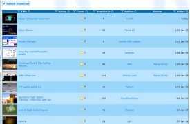
So I have had this idea for months now that we need to update the downloads page. So after a while i created a mock-up screenshot on how it should look like, but since i suck at asp-coding, I got help from Flava on this one. With his excellent coding skills and dedication and throwing out ideas back and forth with eachother I am happy to say we now have a brand new downloads page!

So whats different then? Well a small screenshot will now appear on the main download page, along with a small description! So it will be easier for you to check what game you want to download even before clicking on the download page. This really helps when looking at the archives and older games. There is now also a link to the first review on the download page to highlight the reviews more. Me and flava are open for suggestions of course but I think it already works pretty darn good.

So this is the first part of the daily clicks resolution for 2009 we wanted to get done. Hope you enjoy it, and please lets give a hands up to Flava for coding this and planning this all together! Next up I have a bunch of really good ideas that this site needs. Flava has already offered to help so yay! 2009 is going to be a great year for the dc, keep checking in!

Update! Flava now also has upgraded the Article page, go have a look, looks really good and you can add a description to it now to, woot!

Second Update! Hey why stop at 2 pages! Check out the active page. Ohhhh. Thanks Flava!


Posted by Fanotherpg 17th January, 2009

IMHO there should be genre at main download page so we know if this title would interest us or not.
 
Posted by Flava 17th January, 2009

Good point.. Can't believe that isn't there already. I'll look into it.
 
Posted by Ski 17th January, 2009

Good Job, Flava
 
Posted by W3R3W00F 17th January, 2009

Bravo Flava! סּ_סּ It's spiffy.
 
Posted by W3R3W00F 17th January, 2009

A suggestion. Shouldn't there be an option that lets people view the OLD way too?
 
Posted by OMC 17th January, 2009

Awesome! Wondered why the site was down... Kudos to youdos!
 
Posted by Codemonkey 17th January, 2009

Excellent, one step closer to completing the Codemonkey Master Plan.
 
Posted by W3R3W00F 17th January, 2009

Yeah, I was wondering why the site was down too.
 
Posted by Sketchy 17th January, 2009

Good job guys - it looks great!

There's more pressure to make you're games look good, now that people don't even have to read the description/comments before deciding if they're interested.
 
Posted by Dr. James MD 17th January, 2009

A way to view the old one could be nice too, but I love the new look! Great stuff guys.
Now... Just add this to the project section too

It's great being able to see snapshots of the games though. I dunno how possible this is but in iPhoto you can quickly flick through event photos by hovering the mouse over the events key photo. Left is the first pic, the very far right is the last. Could you add something like that into the site or is that just overly complex?
 
Posted by Flava 17th January, 2009

That's a nice idea James - might be possible in Javascript but I'll have to look into it.

I also suggested to Rikus about the option of allowing users to switch between this view and the old view - I'll probably implement it at a later date. I also plan on updating the other pages soon to match the same sort of layout (projects, articles, reviews .etc).
 
Posted by Kazuma 17th January, 2009

I don't like this. I liked having a list more.

A way to switch back would be nice.
 
Posted by chrilley 17th January, 2009

Looks very good.
 
Posted by Solgryn 17th January, 2009

Good job, much better now. But I have a question about the moo click extension example you have :/ it doesnt seem to work whatever I do :/:/:/!! All moo servers are down or else I have closed for port 1203, but cant I use other ports? or somethiiing?
 
Posted by RenatoDep 17th January, 2009

Good job Flava! I like it!
 
Posted by -J- 17th January, 2009

Definately an upgrade from the old page

I like the screen shots!

 
Posted by Peblo 17th January, 2009

Oh cool, new download page.
 
Posted by Klikmaster 18th January, 2009

I have a suggestion. Where names get cut off because they are too small (Like 'DeadmanD..') it would be nice to be able to hover over it to see the full name. Like we already can with forum posts.
 
Posted by Cecilectomy 18th January, 2009

slight cosmetic suggestion. put genre and review to the far right since they dont sort the actual downloads ascending or descending.
 
Posted by Marko 18th January, 2009

Nice sprucing-up work, Rikus!
 
Posted by Johnny Look 18th January, 2009

Just one thing, what happened to the download page of Little Ghost Joe ?

Cool update btw
 
Posted by Flava 18th January, 2009

You should probably ask Rikus about that Johnny
 
Posted by Muz 18th January, 2009

Lol, I read the title as "Downgraded Upload Page".

The new downloads and articles system is great


Posted by OMC 18th January, 2009

Yea, some of the downloads disappeared. O_o
 
Posted by Flava 18th January, 2009

What do you mean some? As far as I am aware the only one that dissapeared was Little Ghost Joe (and that's because Rikus accidentely deleted it - granted it was a bug with one of the delete buttons, but it's now fixed ). No other downloads should have dissapeared.
Comment edited by Flava on 1/18/2009
 
Posted by Steve Harris 18th January, 2009

Can I make a suggestion? The ability to add code for Vimeo as well Youtube would be great
Comment edited by Steve Harris on 1/18/2009
 
Posted by OMC 18th January, 2009

WAGAH! The actives page does it too!
 
Posted by W3R3W00F 18th January, 2009

I was about to say the same thing! Hoorai!
 
Posted by Jason Orme 19th January, 2009

Lovin It!
 
Posted by UnknownAlly 19th January, 2009

It's better, sexier. I love it!
Comment edited by UnknownAlly on 1/19/2009
 
Posted by Przemulechek 27th January, 2009

Thumbs are great idea.


Author Info

Advertisement

Worth A Click