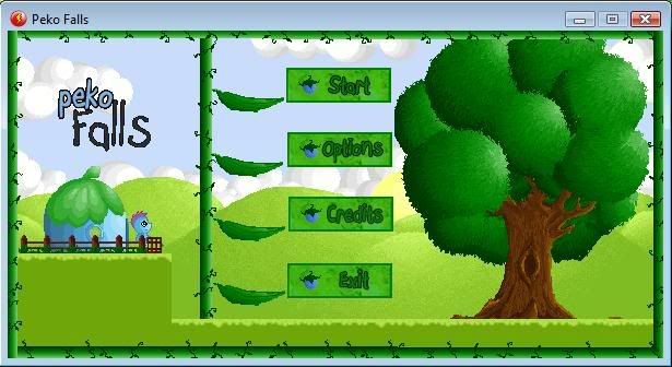
Im not too good at making a menu but heres my first attempt. I used Photoshop to do textures and text. Trying to keep a naturistic theme going on to get the idea of the game across
Heres the screen shot!
Its just a first try so any comments are welcome, i know im just using images from the game but theres not alot i can do without good art :\
The demo will take a little while longer than i originally planned as sadly i decided id rather make sure i was ready for it to be done before keeping to a deadline!
Sorry folks may be a few more weeks yet till level 1 is ready.
I think the menu looks okay, maybe get rid of the border, lengthen the buttons, and add a little text box that explains the option the mouse is over. Or:
1. Remove the border
2. Push the buttons a little closer together.
3. Lengthen the buttons
4. Add a bush next to the tree
5. Have a little person jump out from behind the bush to explain the currently selected option
6. Make only one leaf visible at any one time, and have the leaf shrivel and regrow at a different option whenever you press up or down.
Jon im not THAT smart with MMF lol gimmie a break! I like the leaf idea but it may be a case of just having it appear and reappear when the curser is on/off it.
Shab, it is mouse controlled.
The text was done in PS, i doubt this will be my final menu anyway, Dr James is doing some art for me that i will use for the REAL menu, this is just a placeholder for the time being till i can get that one sorted.
Also Jon what did you mean by 'explain the buttons?' surely theyre self explanitory, start would mean start, options would mean options, credits would mean credits and exit is quit?
I'm not sure you need to explain the buttons, though making the leaf next to the option you are currently highlighting move or something (maybe if it was blowing-like?) would be cool.
I like the border - looks like it's from an old childrens story book (something by Ladybird?) which looks cool. Also, because you're using graphics from the game it highlights the fact that this is the menu and thus differentiates it from the rest of the game.
The buttons are a bit too..."buttonish" in my opinion.
Maybe if you remove the existing leafs and make bigger leafs the buttons with text inside? I think that would be nicer.
Personally I find actual square buttons to fit properly only in applications or games that have strictly a menu without anything but the title of the game (like in old NES games).
1. Make the logo bigger and animated. The game deserves the recognition.
2. Lose the boxes or make them stand-out more, maybe with different colours or, better still, animate them. But not as much as to take focus away from the logo.
3. Change the button font colour to make the words stand out more.

 Advertisement


 Favourite