The Daily Click ::. Projects ::. Mr. Roboto
 

Project: Mr. Roboto
Project Started: 29th November, 2008 Last Update: 3rd March, 2011
Project Owner: Willy C Project Members: Kisguri
Project Type: Platformer Project Progress:

The many faces of Roboto
Posted 28th Sep 09, by Willy C  
We've been having some discussions over at the gamesare forums trying to figure out what direction to go with the art in the game.

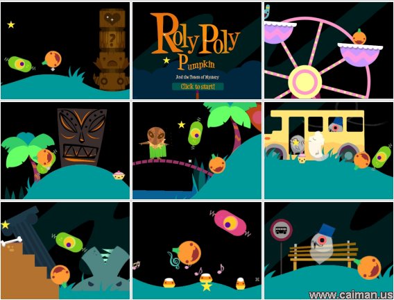
I kind of want a simple, flat, cutsy style. Very much inspired by Adam's "Roly poly pumpkin"
Image

But it might be to simplistic, or perhaps even more likely, I am not that good of an GFX artist to recreate something like this.

Mr. Roboto has been through some different styles during its development. So what are you guys opinions of the following styles? Do you like the current simple style or the old detailed style? Or perhaps some kind of hybrid between the two?

Simple style
Image
Image

Detailed style
Image
Image
Image

Posted by Ski 28th September, 2009


Posted by -Liam- 28th September, 2009

! lol it reminds me of Gyromite! n_n
 
Posted by Marko 28th September, 2009

Hmm, they both look good for their own reasons; the simple version looks great because i tend not to use outlines myself, though the detailed version reminds me of Futurama (which is also good)
 
Posted by -Liam- 28th September, 2009

Oh yeah, I also meant to say the simplistic style looks better IMO
 
Posted by Jon C-B 28th September, 2009

Simplistic fo sho
 
Posted by alastair john jack 29th September, 2009

your first screenshot/mockup is easily the most attractive
 
Posted by Willy C 29th September, 2009

Thanks for the feedback.

Gyromite looks really cool, I'll try it out later.


Project Forums


Favourite

Advertisement

Worth A Click