The Daily Click ::. Projects ::. Sole Gunner
 

Project: Sole Gunner
Project Started: 27th June, 2009 Last Update: 6th December, 2012
Project Owner: Poobical Project Members:
Project Type: Platformer/Action Project Progress:

Need ya opinions guys please
Posted 9th Jul 09, by Poobical  
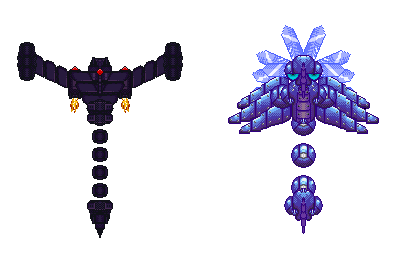
Right well in the first stage (in the demo) there is a boss character called DragonFly. I first sprited the purple one (left) but I wasn't totally happy with it so tonight I spent the last two good hours re-spriting it. I came up with the light purple design (right). I know I'm no sprite/pixel artist and I still need to learn more stuff, but I rather happy how the second one turned out.

All the sprites/objects are seperate in the sprite. (This allows for the boss to move nicely)

Image

Anyway which one do you think is better? Cause people might have different opinions

*edit* I've decided to call the game "Echo Sphere". It fits the overall story quite nicely and also it's different.

Posted by OMC 9th July, 2009

I loikes the ne-yew-in. It looks spiffing!
 
Posted by Dr. James MD 9th July, 2009

Tis bootiful!
 
Posted by Deathbringer 9th July, 2009

Second one looks far better!
 
Posted by Ski 9th July, 2009

I like the first one better. Especially if you shade it so it's uplit red/orange to look more menacing.
 
Posted by W3R3W00F 9th July, 2009

Whoa. Just, WHOA. I like the second one better. I would add some spikes to it's floating spheres tho.
 
Posted by Scott S 9th July, 2009

First one with the seconds segmented tail.
 
Posted by Dr. James MD 9th July, 2009

The first one is too phallic.
 
Posted by Ski 9th July, 2009

Not really.
 
Posted by alastair john jack 13th July, 2009

I really like the 2nd one, definetly has a lot more interesting colours and style.
The first one doesn't seem as exciting in colours, although it could look just as good if you updated it like adam suggested.
 
Posted by Ski 13th July, 2009

The 2nd is too obviously symmetrical, in terms of shading. Im also not so keen on the dithering effect used on the second.
 
Posted by OMC 15th July, 2009

First one's too simple. Second one's too complicated. Perhaps a mix? In terms of both design and color.


Project Forums


Favourite

Advertisement

Worth A Click