The Daily Click ::. News
 

New-look Site: Klik Academy
News posted 1st October, 2004 by David Newton (DavidN)  


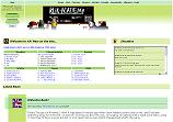
Our esteemed administrator Pete Nattress (or at least, that's what he told me to say) has finished the new look of the Klik Academy site, after six months at the helm. Visit the link to take a look - I have it on authority that it's rather excellent.


Have a look at the new-look site here.


Posted by Pete Nattress 1st October, 2004

i actually told him to say "extremely good looking". anyway, thanks wong.
 
Posted by Tigerworks 1st October, 2004

Great site design!
 
Posted by The Chris Street 1st October, 2004

Yes, but the main content (the news) is still in a super large font
 
Posted by Tigerworks 1st October, 2004

Ever noticed the text resize ability which is in all browsers?
 
Posted by ChrisB 1st October, 2004

It's not page specific, though. The super large font isn't super large either, it's a good size for reading.
 
Posted by Pete Nattress 1st October, 2004

see circy ;) circy's been going on at me about the text size for AGES XD
 
Posted by ChrisB 2nd October, 2004

Well Circy's on holiday now so you won't have to withstand his moaning. Just like his neighbour. *boom tish*


Author Info

Advertisement

Worth A Click