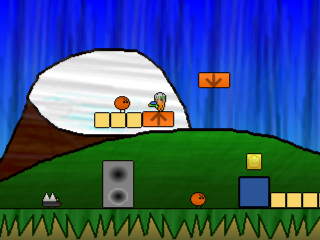
I was trying to add new graphics but had lots of trouble. I'm terrible at it. So i decided to change styles for the background and just scribble. It's quick, easy, and looks kind of pretty.
*most of these are just copied from an older game i abandoned, but I'm going to make the rest of them look this way
On a side note, this game is no longer about destroying speakers, that's just a little extra feature.
I don't like the thick black outlines on the backgrounds, it brings them forward too much. Think you should also remove that texturey thing and keep the gradients.
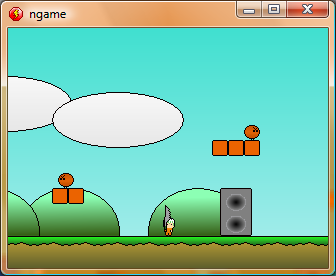
Something between both screenshots.
The new background certainly looks fuller. The first thing I thought is that the outlines shouldn't be thicker on the background. It looks like a few people think the same way.
Personally I would go choose lighter colours for the background. You can probably look to Yoshi's island for inspiration there.

 Advertisement


 Favourite