The Daily Click ::. Projects ::. SqueakRobomouse
 

Project: Squeak:Robomouse
Project Started: 8th May, 2009 Last Update: 20th May, 2009
Project Owner: Poobical Project Members:
Project Type: Platform/Puzzle Project Progress:

Any Better?
Posted 14th May 09, by Poobical  
Image

Right I've tried again to re-do the graphics and stuff. This is the minimalist approach.

Please say you like this design Ha ha ha.

Posted by Sumo148 14th May, 2009

I dont like it, I LOVE it
 
Posted by Jon C-B 14th May, 2009

YES! way better. Love it
 
Posted by Ski 15th May, 2009

Better, try the eye without the big white shine? I often think eyes so thin look better all black
 
Posted by W3R3W00F 15th May, 2009

Kinda cute... Looks fantastic!
 
Posted by pulsecode. 15th May, 2009

Very nice indeed
I prefered the last versions gems/lives counter style though.
I love the fact his tail appears to be an electrical plug

EDIT: Ahh, i see now he uses his tail to recharge! Cool idea indeed
Comment edited by pulsecode. on 5/15/2009
 
Posted by Poobical 15th May, 2009

Thanks for the comments guys, I'm glad you like.

@ Adam: I agree with you, I perfer eyes with out shine if it's small, however with this sprite it doesn't really go well as it starts to look a part of the shading.

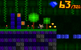
@ Pulsecode: The old gems were not sprited by me, I ripped them from a game called High Sea Havoc. I've change the HUD so it would fit more this style.

Thanks for your kind comments
Comment edited by Poobical on 5/15/2009
 
Posted by AndyUK 15th May, 2009

What?
That isn't better at all. Of course this is just my opinion but... ok they look good but your older graphics look better. They just do. The new ones are flat and just less detailed in general.

Although your old main character did look a little weird. Like an anorexic Big the cat lol. Yeah the new character is better but the whole minimalistic approach is not an improvement whatsoever.

But hey, each to his own.
 
Posted by OMC 16th May, 2009

I like this one and the first one. Use the second one as a cat enemy.
 
Posted by Ski 16th May, 2009

Best design so far by the looks of your avatar
 
Posted by pulsecode. 16th May, 2009

@Poobical: Fair enough! I didn't mean the actual gems though! I meant the counter style. The actual numbers themselves. The new ones just look a bit rough.

Loving your avatar by the way!


Project Forums


Favourite

Advertisement

Worth A Click