The Daily Click ::. Downloads ::. Platformer ::. Retro Jim
 

Retro Jim
Author: Jon C-B Submitted: 4th January, 2009 Favourites:0
Genre: Platformer Downloads: 321
Rated:


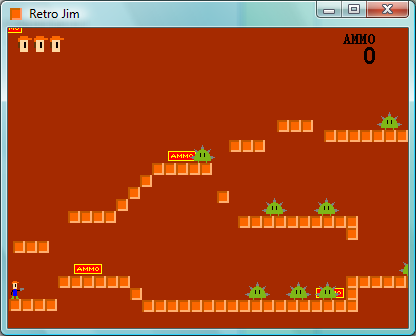
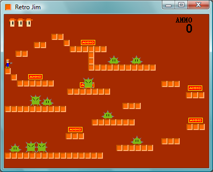
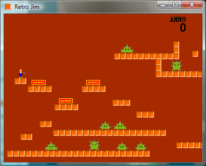
Retro Jim is a short platformer shooter game I made to get back into the feel of making games. It's composed of four levels, the 4th level's a boss. Instructions are in the game. Post feed back please!

Review This Download


http://www.mediafire.com/?1wmgmme1j1w (653.49 kb )


Posted by RedEnchilada 4th January, 2009
Rated :

It was pretty fun while it lasted, but at only five to ten minutes, it didn't seem to last long enough.

Also, don't use the Keyboard and Mouse object for controls. Use the Player Object>Joysitck>Read Jotsitck state, and set it so that button 2 is checked, and there's no arrow. I wanted to set X to shoot, but couldn't.
 
Posted by AndyUK 4th January, 2009
Rated :

It's not a bad game, but it's just as bog standard as a game could possibly be.

Annoying, repetitive music
basic graphics with little to no animation
predictable enemy movement
garish pallete
little variation between levels
really short

oh and why does the boss hurt you when he touches you? I didn't expect that since he has a gun.

So yeah, not a bad game but it's really easy to find better games on TDC.
 
Posted by Jon C-B 4th January, 2009

RedEchidna, do you mean that I should make button 2, button 1 is already taken, to Space Bar and do button 2 is fired?
 
Posted by RedEnchilada 7th January, 2009
Rated :

Yes, exactly.
 
Posted by Jon C-B 7th January, 2009

Ok its done. Nevermind, I'm more interested in doing another game right now.
Comment edited by Jon C-B on 1/7/2009
 
Posted by Zezard 13th January, 2009
Rated :

It didn't feel very retro to me, if you didn't mean a simple klick-game kind of retro.

The boss was pretty cool, felt like a megaman boss from the nes era, but other than that it was pretty boring.

I think you should have tried to make more interesting environments, like lots of various little pixely details. For example you could have made some level so that it looked like a cave, and have added some strange plants and ponds of water and rocks and stuff.

The enemies were pretty uninspiring as well. I don't mean that they should have had been more graphically detailed (though they could have had different colours), but you should have given them more interesting diffencies in their movments. One could walk back an forth, while another walked around the platforms and a third could fly or something like that.

Good luck with your next project.
 
Posted by Jon C-B 18th January, 2009

Thanks for the comment Zezard, that's 2 times now you've given me good gaming advice. And thanks about the boss comment, I was proud of myself for figuring out how to do simple AI and stuff.


Author

Favourite


Advertisement

Worth A Click