It looks great, one critique I do have for you is your highlight and shadow work, it's good to see you've established that the light is originating from the upper left and thus shadows will appear on the lower right. Your next step would be to define form through those light values, not just the outline. If we were to take away that outline and look at just the colouring on, say, just the skin, we would see for example a cookie cut in her shape, rather than seeing her form defined through light and shadow.
This is a rather crude example.. (whipped it up in MSPaint in a minute) but hopefully I can illustrate my point.
Originally Posted by jthongbai It looks great, one critique I do have for you is your highlight and shadow work, it's good to see you've established that the light is originating from the upper left and thus shadows will appear on the lower right. Your next step would be to define form through those light values, not just the outline. If we were to take away that outline and look at just the colouring on, say, just the skin, we would see for example a cookie cut in her shape, rather than seeing her form defined through light and shadow.
This is a rather crude example.. (whipped it up in MSPaint in a minute) but hopefully I can illustrate my point.
Keep it up, it's quite awesome already
This picture is better than most digital art I've seen posted on TDC recently, simply because of the lighting technique. Every recent piece of art looks like one of those old-school plastic "3D" stickers.
Which brings me to comment on Joellie's picture: It's good, but it's not good, for the reason I just mentioned.
Lol that really didnt make all that sence, you contradicted yourself twice! But i think i get it, it doesnt look 3D enough?
I did it in about 2 hours last night at 12am so obviously not my best, ive done better shading before, for example this one:
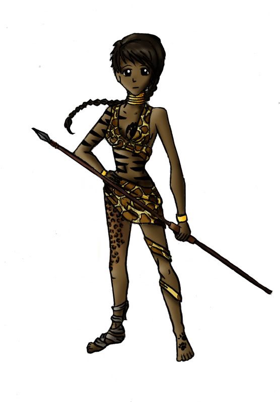
But her arms arent actually 'beefy' enough to have TOO much tone. Shes supposed to look like 'gaurdian' like. Like a gaurdian of african sevannah, so shes all the elements of the animals but in her own way feminine.
Very enjoyable for my eyes, art wise. I was never the kid who got turned on by pictures of Lara Croft. Not when we had a supply of my friend's dad's dirty videos when we were 14....
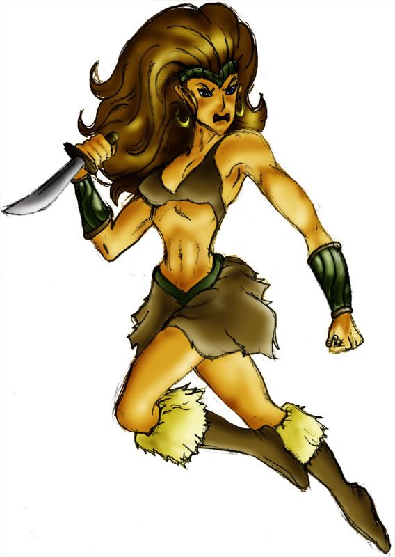
Wow, nice. I like the way you light it. I don't really mind it "not looking 3d", it just looks great the way it is. The first one looks a bit more 'autoshaded', the second one is just great.
Disclaimer: Any sarcasm in my posts will not be mentioned as that would ruin the purpose. It is assumed that the reader is intelligent enough to tell the difference between what is sarcasm and what is not.
The first one i did off the top of my head with the help of a figure pose and the second one was done from a tutorial book which is what i used to do. Thats why its SO shaded because i followed the guide.
Im happy with it, because im not always good at drawing the bodies but i think it turned out ok!
The second one is quite good, it's obvious the light source is below the woman, making it very dramatic. Strong lighting creates strong contrast and sometimes can really improve a picture. I think if I saw the same thing without that lighting, I probably wouldn't like it very much. Also, the anatomy is nicer to look at, slightly exaggerated (observe the width of the smallest part of her waist in relation to her face; they appear to be about the same circumference) but has better form or representation of her form than your original post's figure. Proportionally, there's nothing wrong with her but if you compare the two images, one might say that the African girl doesn't show a lot of character through her form and body language.
You've definitely got skills, so you're well on your way I'm not a great digital artist, but the same rules will apply to traditional artwork which I swear by. I have great respect for digital art and CG, I'm just obsessed with doing art by hand.
Yes i LOVE to draw it by hand, but i HATE colouring by hand. Digital all the way with that one lol thanks tho, yeah i like my 2nd oen better but im happy with my proportions on this one and allof the details like the tattoos etc
n/a
Deleted User
12th January, 2009 at 04:26:17 -
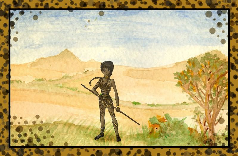
Don't listen to them Joellie, they aren't even looking at the picture. They're just saying it's good to make you like them.
I love that landscape! It's better than anything I ever drew...
Also, don't listen to that Jonerick guy. He's/ She's just Phizzy in a badly disguised costume. The only reason I can't critisize it is that I know if I compared my drawings to your's, I would have to say my drawings could just go to waste! Although I was proud of a few...
I think it looks much better as a complete composition, the mixture of art styles and colour is a little contrasting I think. And to just echo what others said about the shading, it's a little too smooth I think.
It kind of looks like she was cut out of a piece of paper and just glued over the top of the landscape. Not saying that this is a bad thing, because it really draws the attention to 'main' part of the picture, and the background is just some artistic icing on the graphical cake.
Lots of old cartoons (and new ones in fact) use a method like this, where the background is just quickly painted or whatever and doesn't match the artistic style of the character. Take Spongebob for example, his colours are very bold and edges quite sharp and defined, but the underwater scenery like the sand and blue background is very smooth and slightly more realistic than himself.
The shadow under her feet helps her blend into the background a bit more, however her right foot doesn't quite seem to 'sit on the ground', almost as if she's standing on her toes. Maybe you could have a few blades of grass going over top of her foot so she seems more "there" if you know what I mean .
The leopard splotches were a really good idea, I think they frame the picture well and honestly it wouldn't be nearly as effective without them.
Wow, that's nice. The character sticks out a lot from the background, but it's ok. Reminds me of those old 90s adventure games where you know who the characters are and what items to pick up because they stick out from the background.
Disclaimer: Any sarcasm in my posts will not be mentioned as that would ruin the purpose. It is assumed that the reader is intelligent enough to tell the difference between what is sarcasm and what is not.
Nice art! LOL at the lion. I read the whole topic, got to the part where you mentioned that the lion was botched, and thought: "Wait, there was a lion in the picture?" Overall great job. I actually don't like the second one as much as the first, but that's just my personal opinion.

 Advertisement


 )
)


 Edited by W3R3W00F


 The only reason I can't critisize it is that I know if I compared my drawings to your's, I would have to say my drawings could just go to waste! Although I was proud of a few...