So I've updated the developer log for ArcaneTale to let you guys know about the progress, head over to the Projects page for more information, and please post some feedback. However I'm actually more concerned right now about feedback aimed towards the new lighting that I've put into the game. What you like? What you dislike. Feel free to let me know. I mean in all fairness, the idea being making an Online game is so that the people who play it, like it, right?
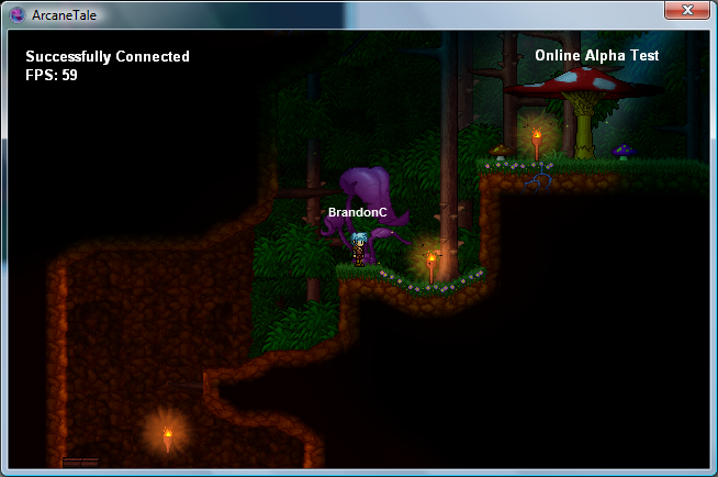
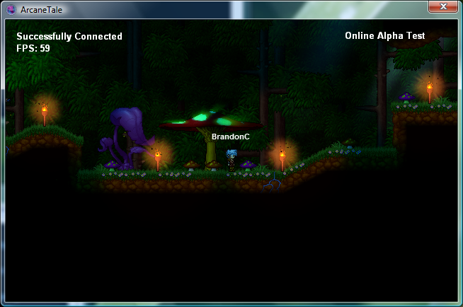
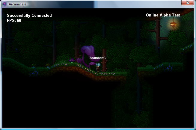
This first screenshot shows a slightly newer area which shows how the world is not going to be as plain as it may seem at a glance. There will be some visual eye candy rewards for exploring uncharted areas of the world.
To anyone who's seen the original ArcaneTale tech demo video, one major flaw you might have noticed was the caverns and how they lit up when you went so far into them. The new lighting gets rid of this entirely.
I major personal complaint I had about the original, was how overpowering and blooming the fire torches were. They failed to actually do their original job, which was light the area. So here we have much smaller, animated blooms, but the torches will correctly light the proximity they reach.
World too dark for you at night? Well the first of many spells was recently added into the game. It creates your own personal light. Based on the strength of the spell, the light will be bigger, brighter, and last longer. This light will also work online, so for friends who don't have particularly high powered light spells, you can aid their adventures, by casing yours on them or being around them when you've cast it on you.
PS: The black dots and slashes around the lights are actually insects. They flutter and fly around, which only looks correct when fully animated.
Uh, it looks very nice and all that, but surely this is technically the same as when TDC newbs point out they've posted a game and people should go and look at it. People will see your project, no need to point it out
Originally Posted by -Adam- People will see your project, no need to point it out
I fully disagree. I wouldn't have bothered to click his project because of the rather generic name unless it got frontpaged.
I'm assuming the lighting is dynamic? If that's the case, then static screenshots won't do the system justice. Other than that, the only thing I have to say is that the torches have a little too much bloomy effect. Maybe tone down the graphic on them? The lights look too orange, too. I might just be used to fire being more of a bright yellow with an orange glow, though.
Well I dont think the lighting is particularly cold as such, it's just not that realistic. The light sources are coming from all over the place, and to me it looks kinda blotchy. Some of the lighting effects the scenery around it, yet some of it doesn't, like the little path lamps. The big, misfitting purple plant hardly seems effected at all by the smaller lights.
Having said that it's still better than the average click game's "atmostpheric" lighting, but still doesn't seem quite real to me.
Edit:
"I fully disagree. I wouldn't have bothered to click his project because of the rather generic name unless it got frontpaged."
So you think it's perfectly acceptable if everyone made a new thread to point out they've updated their project page, and want feedback? Imagine if Hempuli did that for his FIG project which he updated once every other day, or James did it for Tormishire. It's not a case of one rule for one person and another for the rest.
i think your both right. after all, its your creation you can advertise it any way you wish. but on the other side, if everyone does it, then it would be no different then having a projects page, because people will view it the same way, a place that a bunch of people have their stuff, some will get looked at others will <edit>NOT</edit>, and eventually youll need to start advertising it at a different place, like your fruity pebbles or right smack dab in the middle of murder she wrote. so therefore, i guess we already have the projects page, might as well keep it there... im sorry im done!
Originally Posted by -Adam- People will see your project, no need to point it out
I fully disagree. I wouldn't have bothered to click his project because of the rather generic name unless it got frontpaged.
I'm assuming the lighting is dynamic? If that's the case, then static screenshots won't do the system justice. Other than that, the only thing I have to say is that the torches have a little too much bloomy effect. Maybe tone down the graphic on them? The lights look too orange, too. I might just be used to fire being more of a bright yellow with an orange glow, though.
The static screenshots actually don't do any justice for the lighting at all actually. The lights flicker and pulsate subtly.
I'll defiantly tone down the bloom around the torches.
That is very amazing lighting. One thing though - in the trailer nighttime took on a stronger blue hue, are you dropping that colour change entirely because I thought that was very beautiful. Also do light sources emit a colour as well as light?
IMO Alonso is the only one who's successfully pulled off pixelart with photoshop alpha channel lighting, perhaps take a look at his videos and see how you can improve. Heart Forth Alicia has some great foresty atmosphere.
Originally Posted by Mr Green It would have looked better if rendered gfx were used instead of pixel-art. Pixel art isn't really good with dynamic light in my opinion :/
I don't agree with pre-rendered graphics on a platform game. I honestly do not think it looks nice because it lacks depth.
I've actually always wondered about the whole "Fully Tiled Backdrops" vs "Tiled Outlines with Black Insides" like you use. I've never really figured out which is better. Like with yours, a huge chunk of onscreen is taken up by black 'invisible' areas, inside the walls, whereas other games have that area filled with pointless tiles, with can cause extreme redundancy and makes dark environments more difficult.
Does your lighting engine account for passing through walls, or is it just circles over them?

 Advertisement


 Edited by Silveraura


 The lighting looks ok, but I think it needs a warmer, appearance.