I mostly don't use retro or pixel art style in my graphics. I perfer to use more realistic look(pixel and retro actually fits better on some type of games). How do you think it'll fit to a ww2 tactical top-down shooter. I've have been inspired (in graphics area) by micro-soft Close Combat series, Mark Pay's older games, and iFighter 1/2 just to mention few.
Beginning of a forest fire.
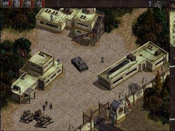
A little compound where 20 marines were ambushed by 30 nazis. (the little counter on the top right is total number of objects) (the 2 first red and blue indicates npc enemy/ npc friend total awareness+shooting ratio so far) (the lower 2 amount of npc's left) Too much added backdrops? Was the limit ~6000.. and what happens after that?
Surprise invasion. I wasnt alive anymore.
Driving over nazis with stolen Kubelwagen while my npc teammate slaughters them with a tommygun. (The vehicle engine is actually very complicated)
Give me feedback especially from the graphics.
edit1:I wouldn't suggest to check my projects page about this.. it's very old data, and about 300% of code, gfx, and sfx has been added.
edit2on't focus on the total actives counter at the top right. The map is very large and has a lot of unused actives in it. The game still runs perfectly on my old computer.
Some styles of art lend themselves to certain types of products more than others, but I still think you can make most styles fit to anything if you try hard enough. I think the style you're using fits a war game really well. The visuals remind me of really old, yet detailed PC games. Good job
Good work, I find it somewhat resembling to Commandos.
But that could just be the millitary setting, a setting you pull of rather well, I might add.
At first glance the things that feels out of place might be the guns. I guess you can pick those up, but think you overdid the white borders there. Without the borders on the guns I'm sure one can make the assumption to pick them up anyway.
The second thing would probably be the explosions that looks way too "pixly" compared to the landscape and characters.
Originally Posted by Deaval Good work, I find it somewhat resembling to Commandos.
But that could just be the millitary setting, a setting you pull of rather well, I might add.
At first glance the things that feels out of place might be the guns. I guess you can pick those up, but think you overdid the white borders there. Without the borders on the guns I'm sure one can make the assumption to pick them up anyway.
The second thing would probably be the explosions that looks way too "pixly" compared to the landscape and characters.
Other than that, good work.
Thanks, and thanks for bringing up Commandos. I'll war.. i mean buy the series. Ah the memories.
I'm adding something: the trees are not cool. I decided to re-make them more realistic mid-European leaf trees. I also made spruce/fir -trees.
But to the comment.
Guns: Normally there are not that many guns on the playground since you have to pick them up. The gun spree you see there is from a bot fight. And bots don't pick up items. Also if there is a knife on a pavement, you can't see it without the outlines.
Explosions: Those arent explosions, they are stable fires. One of the games main setting is that everything, i mean everything can be both set in to fire, and break down(if possible. i.e. rocks don't burn). There is not one backdrop (even added) that is obstacle.
Here is a picture of fragment explosion. It has been tiny amount of time from the start of explosion in the red square. The big picture is after(from mr. obvious).
tip to fellow klikkers:if your game have to have a lots of different looking explosions create explosion makers that are invisible and have values that change size, fragments, and particle types.
Here is some random sprites from the game. Opinions?
The war machinery is accurately created from plans and images and are real ww2 stuff. I like realism.
(the houses have roofs and rafters that go invisible when looked in, if buttresses or walls fall, they will of course fall down)
I like the graphics. It looks like hand drawn realism, or somewhere between cartoon and reality. My only criticism is how some of the graphics integrate with the background. For example, there's a round brick pattern that repeats. I'm not clear on what that is. There are other patterns that do the same thing. They look stuck on. It looks like they were pasted in game?
Send me feedback on my latest game, It Never Ends.
The red brick in the second and third pictures. They look a little too round, and flat, I think. It almost looks like a strange floor pattern. It's supposed to be rubble from the wall? I get it. The round shape is too uniform for rubble. It works for explosions, but not rubble. Other than that, I have nothing else to say about the graphics. It looks good.
Send me feedback on my latest game, It Never Ends.
It's really good. Definitely pixel art but much more girrty than what you would expect to see from most Japanese console games at least.
The only criticism I could possibly make would be that the colours might be a little dark? If you look at games like Battlefield 3 you can see war games can still be really colourful.
There is more contrast in these new trees i'm making. But comparing these images, you made a good point. Although a little darkness adds a certain feeling. Or was it saturation..
Yes, contrast may be an issue, but the low contrast somehow fits the mood. It comes down to taste, I guess. See how many people want higher contrast, or like it as it is. I'm happy with how it looks now, but my taste may not reflect the norm.
When I was testing my last game, I had a tough time getting opinions from people. I even made a poll using google documents so that they could answer questions anonymously. You could try doing the same thing with friends and family if they're afraid to give you an honest opinion.
Send me feedback on my latest game, It Never Ends.
One suggestion regarding the guns, explosives, and other items that the player can pick up...Why not leave off the white outlines? When the player approaches, then highlight the guns with a transparent, lighter shade of gray.
I suggest this to add to the realism, simulating that the areas and corpses must be searched before their contents can be found.
Just a thought. I'm typically not a fan of wargames, but the game honestly looks stunning, hapsi.
The weapon idea sounds good. In some fps games, the item starts to shine when you're near it. Does mmf2 have a shader or effect that could do that? I don't want to create it to all the items with an animation.

 Advertisement


 on't focus on the total actives counter at the top right. The map is very large and has a lot of unused actives in it. The game still runs perfectly on my old computer.
 Edited by hapsi


