The first one is the planning phase, while the second is the actual movie part which I shot before I actually coded it. Not that many would notice the very subtle differences. It's MUCH better looking than the old version though.
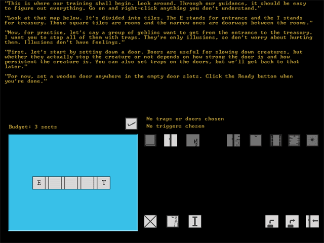
So tell me... what's wrong with it? Is it the blue thingy which I forgot to change along with the rest of the color scheme? Is it the dull brownish text I stole from my other game? Or is it the 2-color buttons? Or something else?
Disclaimer: Any sarcasm in my posts will not be mentioned as that would ruin the purpose. It is assumed that the reader is intelligent enough to tell the difference between what is sarcasm and what is not.
MY EYES!!!! THEY'RE BURNING!!!!!!!!! AHHHHHHH!!! MY EYES MY EYES!!!!
Show me the power child,
I'd like to say,
That I'm down on my knees today,
Gives me the butterflies,
Gives me away,
'Til I'm up on my feet again,
I'm feeling outshined.
Nothing is wrong with it, exept that is not all fancy and graphical like some people want. Your sportin the cassic look, wich is awsome in my opinion.
Im guessing those are Icons in the lower right part of the screen, only thing I suggest is to somehow make sure each icon is explained. A suggestion for that would be a mouse over, and a text pops up and tells you what the icon does. (Thats if your even useing the mouse.)
We are the music makers, we are the dreamers of dreams...
It just has way to much blank space, which makes it look amaturish. The buttons need to be bigger, and the interface needs a "theme". Something like the buttons being shields, maybe. Since the interface is the only graphics in the game, you might as well make it look pleasing.
99 percent chance that the above post is 100 percent correct.
Rycon:
There's already a mouse-over thing. It was around since the original Trap Designer. Now that MMF 1.5 can handle things faster, the new mouse-over thing even uses the text blitter object. I just didn't show it off in the screenshots, especially when the cursor disappears and all .
Mr Coffee:
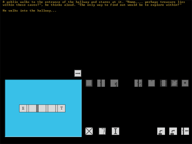
The blank space gets filled up very quickly in the beginning of the later levels. Each of the button leads to a category, which leads to a whole bunch of sub-buttons. I'm just too lazy to shift everything around completely.
But I guess the buttons could use some resizing and the theme thing would be nice. Maybe I'll remake it after I finish all the coding.
Daniel:
Good idea. Maybe if I move the text to the bottom and leave the budget, trap, & trigger 'indicators' at the bottom, the text doesn't look so empty at some moments. Or better yet, maybe I'll just move the blue square thingy to the top left, the buttons to the bottom left and leave the whole right screen to the text.
This habit of typing everything I'm thinking is gonna turn against me some day.
Disclaimer: Any sarcasm in my posts will not be mentioned as that would ruin the purpose. It is assumed that the reader is intelligent enough to tell the difference between what is sarcasm and what is not.
I'm not sure what that meant, but I wish I knew that back when I was in high school. Always had this problem with parenthesises.
Disclaimer: Any sarcasm in my posts will not be mentioned as that would ruin the purpose. It is assumed that the reader is intelligent enough to tell the difference between what is sarcasm and what is not.
Thank you very much indeed for your criticism. It shall be quite useful in my future essays. No sarcasm intended.
Disclaimer: Any sarcasm in my posts will not be mentioned as that would ruin the purpose. It is assumed that the reader is intelligent enough to tell the difference between what is sarcasm and what is not.
I think the problem is that it's a bit...bleak. It's just a black screen with some text and simple box graphics on-I'm not quite sure how to change though. It's like you know it doesn't look right but you're just not sure why...

 Advertisement


