The Daily Click ::. Forums ::. General Chat ::. Logo design help! Will pay upto £15 or a donation to the Daily Click!
 

Post Reply  Post Oekaki 
 

Posted By Message

Va1entine


Registered
  14/12/2003
Points
  367

Has Donated, Thank You!360 Owner
25th January, 2009 at 23:28:03 -

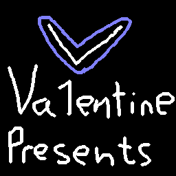
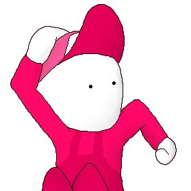
This was my avaitor on halo 2 which i drew on flash some years ago and adopted as my logo. I'm looking for somemone who can re-design this peace (including the text) and give it more of a professional look. I'd be happy to Pay upto 15 pounds if i use your work, or i could donate it to the Daily Click on your behalf! It would be great if someone from the community could help or at least recommend someone! Thanks for your support guys!

Close up
Image

In game shot
Image


Edited by Va1entine

 
n/a

OMC

What a goofball

Registered
  21/05/2007
Points
  3516

KlikCast Musician! Guy with a HatSomewhat CrazyARGH SignLikes TDCHas Donated, Thank You!Retired Admin
26th January, 2009 at 01:08:42 -

I love designing logos, but I don't know how professional I can make them look.

If I'm bored later, I'll give it a try.


aphant


Registered
  18/05/2008
Points
  1242
26th January, 2009 at 17:54:30 -

Redesign how? Remake it, or come up with a new design? In either case, what kind of colour scheme are you looking for?


Silveraura

God's God

Registered
  08/08/2002
Points
  6747

Game of the Week WinnerKlikCast StarAlien In Training!VIP Member360 OwnerWii OwnerSonic SpeedThe Cake is a LieComputerChristmas Tree!
I am an April Fool
26th January, 2009 at 19:50:24 -

Image
I just re-made your current logo.

 
http://www.facebook.com/truediamondgame

Ski

TDC is my stress ball

Registered
  13/03/2005
Points
  10130

GOTW WINNER CUP 1!GOTW WINNER CUP 2!GOTW WINNER CUP 3!KlikCast HelperVIP MemberWii OwnerStrawberryPicture Me This Round 28 Winner!PS3 OwnerI am an April Fool
Candy Cane
26th January, 2009 at 21:50:05 -

That is SO Vista fan art.

 
n/a

OMC

What a goofball

Registered
  21/05/2007
Points
  3516

KlikCast Musician! Guy with a HatSomewhat CrazyARGH SignLikes TDCHas Donated, Thank You!Retired Admin
26th January, 2009 at 23:41:11 -

*Waiting for a Mac fanatic to come along and start the whole Chicken-and-the-egg argument.*


Cecilectomy

noPE

Registered
  19/03/2005
Points
  305

Has Donated, Thank You!VIP MemberWeekly Picture Me This Winner!Cardboard BoxGhostbuster!Pokemon Ball!ComputerBox RedSanta HatSnowman
I am an April Fool
26th January, 2009 at 23:51:50 -


Originally Posted by -Adam-
That is SO Vista fan art.


it looks more like an iphone/itouch app logo. but thats just me. i use xp so im not keen on what vista looks like anymore.

 
n/a

-Nick-

Possibly Insane

Registered
  24/11/2002
Points
  2468

VIP Member
27th January, 2009 at 01:13:40 -

I thought it looked like a car manufacturer badge.

 
Project: Roller Coaster is on it's way!
http://www.projectrollercoaster.co.uk/
http://www.craftsncreatures.com

Silveraura

God's God

Registered
  08/08/2002
Points
  6747

Game of the Week WinnerKlikCast StarAlien In Training!VIP Member360 OwnerWii OwnerSonic SpeedThe Cake is a LieComputerChristmas Tree!
I am an April Fool
27th January, 2009 at 01:29:34 -


Originally Posted by -Adam-
That is SO Vista fan art.


That style has been around longer then Vista, nimrod.

 
http://www.facebook.com/truediamondgame

Va1entine


Registered
  14/12/2003
Points
  367

Has Donated, Thank You!360 Owner
27th January, 2009 at 16:02:17 -

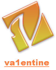
Thanks for your design BrandonC, your version certainly is an improvment. I particually like the way you've changed how the shades meet, however i'm looking for something abit more professional looking.

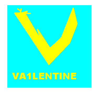
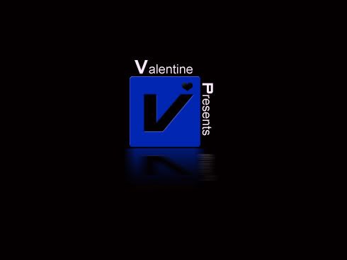
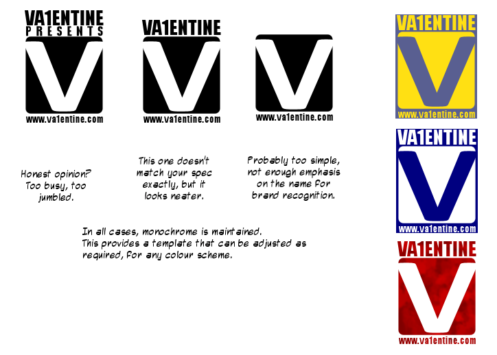
I would like the general design to stay the same at least with the square box and the big V for Va1entine, The colour scheme i'd also like to remain the same. I'll upload some other logo's tonight to give more of a feel for what i'm looking for! Thanks agaion for your support guys!!!!!!!!!!

 
n/a

OMC

What a goofball

Registered
  21/05/2007
Points
  3516

KlikCast Musician! Guy with a HatSomewhat CrazyARGH SignLikes TDCHas Donated, Thank You!Retired Admin
27th January, 2009 at 17:44:25 -

This may not be what you're looking for, but it was fun to make anyway.
Image
I just now reread your request and realized that you wanted me to redo the text. I didn't notice that last time and found the same font you used. If you don't think it's too horribly ugly, I'll see if I can get creative with the text too.


Dr. James MD

Addict

Registered
  08/12/2003
Points
  11941

First GOTW AwardSecond GOTW AwardThird GOTW AwardPicture Me This -Round 26- Winner!
27th January, 2009 at 18:42:26 -

I love OMC's graphic but also Brandons font. Love the SD/Floppy disk shape.

 
Image
http://uk.youtube.com/watch?v=j--8iXVv2_U
On the sixth day God created Manchester
"You gotta get that sand out your vaj!" x13
www.bossbaddie.com

Klikmaster

Master of all things Klik

Registered
  08/07/2002
Points
  2599

Has Donated, Thank You!You've Been Circy'd!VIP MemberPS3 Owner
27th January, 2009 at 19:19:04 -

Image

Not anywhere near cool enough. I like Brandon's the best so far. I don't think anyone has chosen a decent font yet though.

 
n/a

Marko

I like you You like you

Registered
  08/05/2008
Points
  2804

Has Donated, Thank You!Game of the Week WinnerVIP Member360 OwnerDos Rules!Happy FellahCrazy EvilI am an April FoolGingerbread House
27th January, 2009 at 19:20:45 -

What do ya think? I jazzed up the '1' bit in the name Va1entine and tried to give it a 3D look.

Image

Edited by Marko

 
Image

Subliminal Dreams. . ., daily gaming news and the home of Mooneyman Studios!
www.mooneyman-studios.webs.com

OMC

What a goofball

Registered
  21/05/2007
Points
  3516

KlikCast Musician! Guy with a HatSomewhat CrazyARGH SignLikes TDCHas Donated, Thank You!Retired Admin
27th January, 2009 at 19:41:20 -

I'll see what I can do about making a better text later...


Dr. James MD

Addict

Registered
  08/12/2003
Points
  11941

First GOTW AwardSecond GOTW AwardThird GOTW AwardPicture Me This -Round 26- Winner!
27th January, 2009 at 20:04:01 -

That reminds me of Factor 5
Image

Edited by Dr. James MD

 
Image
http://uk.youtube.com/watch?v=j--8iXVv2_U
On the sixth day God created Manchester
"You gotta get that sand out your vaj!" x13
www.bossbaddie.com

Ski

TDC is my stress ball

Registered
  13/03/2005
Points
  10130

GOTW WINNER CUP 1!GOTW WINNER CUP 2!GOTW WINNER CUP 3!KlikCast HelperVIP MemberWii OwnerStrawberryPicture Me This Round 28 Winner!PS3 OwnerI am an April Fool
Candy Cane
27th January, 2009 at 20:06:16 -

Klikmaster's reminds me of a Daytime TV show producer logo, Mark Radon's reminds me of the end of a car advert.

 
n/a

OMC

What a goofball

Registered
  21/05/2007
Points
  3516

KlikCast Musician! Guy with a HatSomewhat CrazyARGH SignLikes TDCHas Donated, Thank You!Retired Admin
27th January, 2009 at 20:16:23 -

Oi, I hate my computer. I made a new text... it honestly doesn't look so good but I accidentally finalized it before I was done. Then my ancient computer froze and I sat here for ages trying to get it to come back on.

Image
It's the same URL so the one above will be changed too.

I'm goin' back in. >:| Wish me luck. (Hopefully I'll be bearing presents on my return.)

CHAAAAAAAAAAAAAAAARGE! D:<

Edited by OMC


Marko

I like you You like you

Registered
  08/05/2008
Points
  2804

Has Donated, Thank You!Game of the Week WinnerVIP Member360 OwnerDos Rules!Happy FellahCrazy EvilI am an April FoolGingerbread House
27th January, 2009 at 20:20:51 -

Dr. James, what the hell is Factor 5? I've never heard of it but it sounds like a Sci-fi show of some kind (i'm resisting Wiki'ing it because i'd rather hear what you think of it, if it's a show!) And -Adam-, yeah i see what you mean though it was unintentional. Kinda looks like a Citroen logo too, now i think about it...

 
Image

Subliminal Dreams. . ., daily gaming news and the home of Mooneyman Studios!
www.mooneyman-studios.webs.com

Ski

TDC is my stress ball

Registered
  13/03/2005
Points
  10130

GOTW WINNER CUP 1!GOTW WINNER CUP 2!GOTW WINNER CUP 3!KlikCast HelperVIP MemberWii OwnerStrawberryPicture Me This Round 28 Winner!PS3 OwnerI am an April Fool
Candy Cane
27th January, 2009 at 20:22:28 -

Don't get me wrong though, it still looks nice

 
n/a

Marko

I like you You like you

Registered
  08/05/2008
Points
  2804

Has Donated, Thank You!Game of the Week WinnerVIP Member360 OwnerDos Rules!Happy FellahCrazy EvilI am an April FoolGingerbread House
27th January, 2009 at 20:27:35 -

Thanx I just read about Factor 5, didn't realise they made so many great games, especially the Rogue Squadron games for the N64/Gamecube. I've even got the first one on N64 but still didn't realise!

Back on topic...... i have nothing else to say now.

 
Image

Subliminal Dreams. . ., daily gaming news and the home of Mooneyman Studios!
www.mooneyman-studios.webs.com

OMC

What a goofball

Registered
  21/05/2007
Points
  3516

KlikCast Musician! Guy with a HatSomewhat CrazyARGH SignLikes TDCHas Donated, Thank You!Retired Admin
27th January, 2009 at 20:29:01 -

Factor 5 used to be a Nintendo 2nd party developer once upon a time. Made middleware for Nintendo's consoles. I think they're close to going under now, if I remember right.

Anyway, I've decided that I don't want to put up with my computer's slowage at the moment, so the one above will have to do until I get enough patience to try again.

I shall now eat an apple turnover and drink some coffee.

EDIT: How come the two graphics are different? O_o They're the same URL.

Oh, also, I wasn't aiming for a floppy look... It's supposed to be sort of 3D looking but without a visible edge on one side. It would work as a floppy shape except that the left side's angle would be off a bit.

Edited by OMC


-Nick-

Possibly Insane

Registered
  24/11/2002
Points
  2468

VIP Member
27th January, 2009 at 20:44:37 -

Klikmaster, I think yours would look absolutely fantastic if you just made the coloured background a bit stronger!

 
Project: Roller Coaster is on it's way!
http://www.projectrollercoaster.co.uk/
http://www.craftsncreatures.com

aphant


Registered
  18/05/2008
Points
  1242
27th January, 2009 at 20:48:28 -

Image


Ski

TDC is my stress ball

Registered
  13/03/2005
Points
  10130

GOTW WINNER CUP 1!GOTW WINNER CUP 2!GOTW WINNER CUP 3!KlikCast HelperVIP MemberWii OwnerStrawberryPicture Me This Round 28 Winner!PS3 OwnerI am an April Fool
Candy Cane
27th January, 2009 at 21:07:20 -

Here is my crappy attempt

Image

 
n/a

OMC

What a goofball

Registered
  21/05/2007
Points
  3516

KlikCast Musician! Guy with a HatSomewhat CrazyARGH SignLikes TDCHas Donated, Thank You!Retired Admin
27th January, 2009 at 21:12:15 -

Wow, this topic suddenly exploded with logo ideas. When it was first posted nobody put anything up.


Dr. James MD

Addict

Registered
  08/12/2003
Points
  11941

First GOTW AwardSecond GOTW AwardThird GOTW AwardPicture Me This -Round 26- Winner!
27th January, 2009 at 23:07:28 -

I'm not keen on the font of your new one OMC. When it comes to logos you need something quick to read. Block colours or soft gradients, no outlines (unless its against a certain type of background) and all that.

^ reminds me of Rockstar Leeds logo. Or the one they use on the LCS and VCS games anyroad.

 
Image
http://uk.youtube.com/watch?v=j--8iXVv2_U
On the sixth day God created Manchester
"You gotta get that sand out your vaj!" x13
www.bossbaddie.com

Silveraura

God's God

Registered
  08/08/2002
Points
  6747

Game of the Week WinnerKlikCast StarAlien In Training!VIP Member360 OwnerWii OwnerSonic SpeedThe Cake is a LieComputerChristmas Tree!
I am an April Fool
27th January, 2009 at 23:27:41 -

Image
Updated with some tweaks in the style.

 
http://www.facebook.com/truediamondgame

OMC

What a goofball

Registered
  21/05/2007
Points
  3516

KlikCast Musician! Guy with a HatSomewhat CrazyARGH SignLikes TDCHas Donated, Thank You!Retired Admin
27th January, 2009 at 23:30:42 -


Originally Posted by Dr. James
I'm not keen on the font of your new one OMC. When it comes to logos you need something quick to read. Block colours or soft gradients, no outlines (unless its against a certain type of background) and all that.

^ reminds me of Rockstar Leeds logo. Or the one they use on the LCS and VCS games anyroad.


Well, I can get rid of that effect. What do you think of the font itself? Think I should keep it?

Thanks for the critique.


Dr. James MD

Addict

Registered
  08/12/2003
Points
  11941

First GOTW AwardSecond GOTW AwardThird GOTW AwardPicture Me This -Round 26- Winner!
27th January, 2009 at 23:36:10 -

It's hard to say, but I'd be inclined to say change it. Given that "Valentine Presents" takes up quite a bit of space you don't want a font that's too thin or cluttered.

Also a good logo needs to work on any kind of background with only the simpliest of colour changes.

 
Image
http://uk.youtube.com/watch?v=j--8iXVv2_U
On the sixth day God created Manchester
"You gotta get that sand out your vaj!" x13
www.bossbaddie.com

aphant


Registered
  18/05/2008
Points
  1242
27th January, 2009 at 23:41:11 -


Originally Posted by Dr. James
Also a good logo needs to work on any kind of background with only the simpliest of colour changes.


It also needs to be easy to print. BrandonC's first logo and Klikmaster's logo both look nice, but no one would want to print it. They'd be more suited to things that would stay 2D and virtual, like installers or desktop icons.

Simpler is better!


Dr. James MD

Addict

Registered
  08/12/2003
Points
  11941

First GOTW AwardSecond GOTW AwardThird GOTW AwardPicture Me This -Round 26- Winner!
28th January, 2009 at 00:05:28 -

^
As always! But will Valentine be printing these? A lot of them here would be too dark to print.
The most recogniseable logos are always paired with a monochrome version too. Usually.

 
Image
http://uk.youtube.com/watch?v=j--8iXVv2_U
On the sixth day God created Manchester
"You gotta get that sand out your vaj!" x13
www.bossbaddie.com

Ski

TDC is my stress ball

Registered
  13/03/2005
Points
  10130

GOTW WINNER CUP 1!GOTW WINNER CUP 2!GOTW WINNER CUP 3!KlikCast HelperVIP MemberWii OwnerStrawberryPicture Me This Round 28 Winner!PS3 OwnerI am an April Fool
Candy Cane
28th January, 2009 at 00:29:48 -

Hmmm... let's see... "Valentine presents"- I wonder if he's printing them, or using them at the start of his game?

Edited by Ski

 
n/a

Va1entine


Registered
  14/12/2003
Points
  367

Has Donated, Thank You!360 Owner
28th January, 2009 at 03:16:49 -

It would just be for my game i don't really need to print anything

 
n/a

Va1entine


Registered
  14/12/2003
Points
  367

Has Donated, Thank You!360 Owner
28th January, 2009 at 03:23:24 -

Really impressed with your designs guys!

 
n/a

aphant


Registered
  18/05/2008
Points
  1242
28th January, 2009 at 07:46:09 -


Originally Posted by -Adam-
Hmmm... let's see... "Valentine presents"- I wonder if he's printing them, or using them at the start of his game?


Hmmm... let's see... Cut out "Va1entine presents" and you could have a logo that you can put anywhere. How many of these designs would work without it?


Ski

TDC is my stress ball

Registered
  13/03/2005
Points
  10130

GOTW WINNER CUP 1!GOTW WINNER CUP 2!GOTW WINNER CUP 3!KlikCast HelperVIP MemberWii OwnerStrawberryPicture Me This Round 28 Winner!PS3 OwnerI am an April Fool
Candy Cane
28th January, 2009 at 13:25:43 -

Yes but seriously now, it's quite obvious he needs it for his games.

 
n/a

OMC

What a goofball

Registered
  21/05/2007
Points
  3516

KlikCast Musician! Guy with a HatSomewhat CrazyARGH SignLikes TDCHas Donated, Thank You!Retired Admin
28th January, 2009 at 14:07:23 -

Actually, all of them would work on paper, minus Klikmaster's, I think.

Edited by OMC


Jon Lambert

Administrator
Vaporware Master

Registered
  19/12/2004
Points
  8235

VIP MemberWii OwnerTDC Chat Super UserI am an April FoolSSBB 3265-4741-0937ACCF 3051-1173-8012360 Owner
28th January, 2009 at 15:31:03 -

Va1entine, before you choose a design, I have about 6 that I made in my Theory of Knowledge class this morning. They're only on paper and I'm in school right now, so I can't draw them on the computer just yet. That will be about 8:00 tonight, since I have to go to work today. So please hold off until then.

 
Sandwich Time!Whoo!

JoyCheck & KeyCheck Widgets
For easy implementation of customizable joystick and keyboard controls.
http://www.create-games.com/download.asp?id=8364

OMC

What a goofball

Registered
  21/05/2007
Points
  3516

KlikCast Musician! Guy with a HatSomewhat CrazyARGH SignLikes TDCHas Donated, Thank You!Retired Admin
28th January, 2009 at 15:57:28 -

"Theory of Knowledge"? That sounds fun.

Edited by OMC


DeadmanDines

Best Article Writer

Registered
  27/04/2006
Points
  4758
28th January, 2009 at 16:10:18 -

My contribution (click it to enlarge):

Image

The top three are variations on the same theme, and I would recommend the middle one. The other two just show how it can be altered if needs be.

It is monochrome, which maximises its versatility as shown on the examples to the right. You can change it to fit almost any colour scheme, meaning you don't have to worry if your games wildly differ in tone or theme, or if you change your site design. You can also enhance the logo to fit with every game, as its shape is easily recognisable (e.g. make it drip with blood in a horror game, make it out of stone in a caveman game, etc).

And if you ever did go professional, the monochrome base will print out perfectly on any B/W Laser Printer.

Could be fun!

 
191 / 9999 * 7 + 191 * 7

Marko

I like you You like you

Registered
  08/05/2008
Points
  2804

Has Donated, Thank You!Game of the Week WinnerVIP Member360 OwnerDos Rules!Happy FellahCrazy EvilI am an April FoolGingerbread House
28th January, 2009 at 19:14:43 -

Love the designs, especially the colour schemes you've picked. I also like the way they remind me of some kind of record label - very professional looking indeed!

 
Image

Subliminal Dreams. . ., daily gaming news and the home of Mooneyman Studios!
www.mooneyman-studios.webs.com

Ski

TDC is my stress ball

Registered
  13/03/2005
Points
  10130

GOTW WINNER CUP 1!GOTW WINNER CUP 2!GOTW WINNER CUP 3!KlikCast HelperVIP MemberWii OwnerStrawberryPicture Me This Round 28 Winner!PS3 OwnerI am an April Fool
Candy Cane
28th January, 2009 at 19:17:46 -

Reminds me of a parental guidance icon.

 
n/a

Dr. James MD

Addict

Registered
  08/12/2003
Points
  11941

First GOTW AwardSecond GOTW AwardThird GOTW AwardPicture Me This -Round 26- Winner!
28th January, 2009 at 19:30:06 -

Navy blue/white just reminds me of a pack of jonnies
But I like the middle monochrome one. Not keen on the textured red one.

If I had it my cheeky way I'd extend the box somehow and make Va1entine and the address cutouts too, like the V itself.

 
Image
http://uk.youtube.com/watch?v=j--8iXVv2_U
On the sixth day God created Manchester
"You gotta get that sand out your vaj!" x13
www.bossbaddie.com

Matt Boothman

The Nissan Micra of forum members

Registered
  20/09/2002
Points
  109

Game of the Week Winner
28th January, 2009 at 20:39:11 -

Image
Image
Image
Image
Image
Image
Image

Give us a shout if you like any of them.

 
http://soundcloud.com/normbo - Listen to my music.

OMC

What a goofball

Registered
  21/05/2007
Points
  3516

KlikCast Musician! Guy with a HatSomewhat CrazyARGH SignLikes TDCHas Donated, Thank You!Retired Admin
28th January, 2009 at 20:41:35 -

I likes the bottom one. And Dines' are neat too.


Silveraura

God's God

Registered
  08/08/2002
Points
  6747

Game of the Week WinnerKlikCast StarAlien In Training!VIP Member360 OwnerWii OwnerSonic SpeedThe Cake is a LieComputerChristmas Tree!
I am an April Fool
28th January, 2009 at 20:52:55 -


Originally Posted by Boothman
Give us a shout if you like any of them.


Who is us? I wasn't aware it took multiple people to make a logo.

 
http://www.facebook.com/truediamondgame

Ski

TDC is my stress ball

Registered
  13/03/2005
Points
  10130

GOTW WINNER CUP 1!GOTW WINNER CUP 2!GOTW WINNER CUP 3!KlikCast HelperVIP MemberWii OwnerStrawberryPicture Me This Round 28 Winner!PS3 OwnerI am an April Fool
Candy Cane
28th January, 2009 at 21:05:33 -

To do with dialect. Look it up.

 
n/a

OMC

What a goofball

Registered
  21/05/2007
Points
  3516

KlikCast Musician! Guy with a HatSomewhat CrazyARGH SignLikes TDCHas Donated, Thank You!Retired Admin
28th January, 2009 at 21:31:59 -

Haha, I didn't even notice that. I read the message in a British accent so it made sense...

I'm turning British.


Silveraura

God's God

Registered
  08/08/2002
Points
  6747

Game of the Week WinnerKlikCast StarAlien In Training!VIP Member360 OwnerWii OwnerSonic SpeedThe Cake is a LieComputerChristmas Tree!
I am an April Fool
28th January, 2009 at 22:25:22 -

Well not everyone has a British accent, and I'd love to see Adam hold me accountable for that being a bad thing, and not get similar ignorance back at him by other people.

 
http://www.facebook.com/truediamondgame

Dr. James MD

Addict

Registered
  08/12/2003
Points
  11941

First GOTW AwardSecond GOTW AwardThird GOTW AwardPicture Me This -Round 26- Winner!
28th January, 2009 at 22:30:18 -

I used to get confused as a kid when just one of the kids on the street would knock on and ask "playing out with us?". Oh the North.

 
Image
http://uk.youtube.com/watch?v=j--8iXVv2_U
On the sixth day God created Manchester
"You gotta get that sand out your vaj!" x13
www.bossbaddie.com

OMC

What a goofball

Registered
  21/05/2007
Points
  3516

KlikCast Musician! Guy with a HatSomewhat CrazyARGH SignLikes TDCHas Donated, Thank You!Retired Admin
28th January, 2009 at 22:31:23 -

Actually, he really said that because he has multiple personalities. That's why he submitted so many, they all liked different versions.

I don't have a British accent unless I want to.


Dr. James MD

Addict

Registered
  08/12/2003
Points
  11941

First GOTW AwardSecond GOTW AwardThird GOTW AwardPicture Me This -Round 26- Winner!
29th January, 2009 at 00:15:23 -

That'd be hard to pull off! Dialects and accents here change by the road.

 
Image
http://uk.youtube.com/watch?v=j--8iXVv2_U
On the sixth day God created Manchester
"You gotta get that sand out your vaj!" x13
www.bossbaddie.com

W3R3W00F

Drum and Bass Fueled Psycho

Registered
  08/11/2008
Points
  370

VIP MemberCardboard BoxThe Cake is a Lie
29th January, 2009 at 00:28:13 -

Here's some. Sorry if they're not all with the color scheme.
Image
Image
Image
Image
Image
Image


n/a

OMC

What a goofball

Registered
  21/05/2007
Points
  3516

KlikCast Musician! Guy with a HatSomewhat CrazyARGH SignLikes TDCHas Donated, Thank You!Retired Admin
29th January, 2009 at 00:33:01 -

I like the shape of the V, but the colors in it and its outline and the background and the text are discordant and hurt my eyes.

Oh, and Dr. James... I have many British accents. Not near as many as exist, but still quite a few. Sometimes they meld together.

BTW, the L is the 1, not the I.


Edited by OMC


W3R3W00F

Drum and Bass Fueled Psycho

Registered
  08/11/2008
Points
  370

VIP MemberCardboard BoxThe Cake is a Lie
29th January, 2009 at 00:37:15 -

Aw, crap. I was sure it was the I.

 
n/a

Va1entine


Registered
  14/12/2003
Points
  367

Has Donated, Thank You!360 Owner
29th January, 2009 at 02:34:03 -

WAW… What an amazing response to my post!!! Really impressed with the amount of people who have kindly given up their spare time to do this! Every logo in its own right is brilliant! I’ll be dead honest and say that I’ve not come cross one yet which I think I’d like to replace my logo with, but two logo’s so far have really court my eye! -Adam- & DeadmanDines designs.

 
n/a

W3R3W00F

Drum and Bass Fueled Psycho

Registered
  08/11/2008
Points
  370

VIP MemberCardboard BoxThe Cake is a Lie
29th January, 2009 at 03:18:36 -

Hmm... Tbh I think you're going for a more laid back feel, so here's another.
Image

Edit: And another one...
Image

Tbh I think The V should've been darker.

Edit: Here's some more.

Image
Image

Edited by W3R3W00F

 
n/a

UrbanMonk

BRING BACK MITCH

Registered
  07/07/2008
Points
  49567

Has Donated, Thank You!Little Pirate!ARGH SignKliktober Special Award TagPicture Me This Round 33 Winner!The Outlaw!VIP MemberHasslevania 2!I am an April FoolKitty
Picture Me This Round 32 Winner!Picture Me This Round 42 Winner!Picture Me This Round 44 Winner!Picture Me This Round 53 Winner!
29th January, 2009 at 05:19:28 -

Image

Hope you like, if you want the font changed or something let me know.

Enjoy!

 
n/a

Silveraura

God's God

Registered
  08/08/2002
Points
  6747

Game of the Week WinnerKlikCast StarAlien In Training!VIP Member360 OwnerWii OwnerSonic SpeedThe Cake is a LieComputerChristmas Tree!
I am an April Fool
29th January, 2009 at 05:49:00 -

Looks nice, but I think that's just because it's covered in bloom. Take the bloom away, and I don't think there's really much to it.

 
http://www.facebook.com/truediamondgame

UrbanMonk

BRING BACK MITCH

Registered
  07/07/2008
Points
  49567

Has Donated, Thank You!Little Pirate!ARGH SignKliktober Special Award TagPicture Me This Round 33 Winner!The Outlaw!VIP MemberHasslevania 2!I am an April FoolKitty
Picture Me This Round 32 Winner!Picture Me This Round 42 Winner!Picture Me This Round 44 Winner!Picture Me This Round 53 Winner!
29th January, 2009 at 14:13:22 -

I originally planned on adding bloom just the background so as not to distract from the Title, but here is the non-bloomed version anyhow.

Image
Image

And a extra explosive version

Image

Edited by UrbanMonk

 
n/a

Dr. James MD

Addict

Registered
  08/12/2003
Points
  11941

First GOTW AwardSecond GOTW AwardThird GOTW AwardPicture Me This -Round 26- Winner!
29th January, 2009 at 15:17:44 -

Bloom is a real time shader, since that's a Photoshop (or whatever) image it's just known as "blur"

But yea, that above one is too difficult to read on a quick glance over.

 
Image
http://uk.youtube.com/watch?v=j--8iXVv2_U
On the sixth day God created Manchester
"You gotta get that sand out your vaj!" x13
www.bossbaddie.com

Ski

TDC is my stress ball

Registered
  13/03/2005
Points
  10130

GOTW WINNER CUP 1!GOTW WINNER CUP 2!GOTW WINNER CUP 3!KlikCast HelperVIP MemberWii OwnerStrawberryPicture Me This Round 28 Winner!PS3 OwnerI am an April Fool
Candy Cane
29th January, 2009 at 15:30:39 -

To be honest, if it's for a computer game I don't think it matters how complicated the logo is. In most cases the company logo is shown for anywhere up to 20 seconds and maybe even beyond that. I'm not sure why people are still thinking Valentine wants to print this off, he's already stated that he doesn't.

Edited by Ski

 
n/a

Matt Boothman

The Nissan Micra of forum members

Registered
  20/09/2002
Points
  109

Game of the Week Winner
29th January, 2009 at 19:15:28 -


Originally Posted by -Adam-
To be honest, if it's for a computer game I don't think it matters how complicated the logo is. In most cases the company logo is shown for anywhere up to 20 seconds and maybe even beyond that. I'm not sure why people are still thinking Valentine wants to print this off, he's already stated that he doesn't.


It's to do with good design. A logo should always be available in monotone, and should always be "drawable" from memory, no matter what medium it's been displayed through; it make the logo more memorable and thus the company/studio - which is the whole point of a logo.

Oh and the "us" thing - yeh it's about dialect and all that shiz. Dint mean to confuse yas wi' it like.

Edited by Matt Boothman

 
http://soundcloud.com/normbo - Listen to my music.

aphant


Registered
  18/05/2008
Points
  1242
29th January, 2009 at 19:27:03 -


Originally Posted by -Adam-
I'm not sure why people are still thinking Valentine wants to print this off, he's already stated that he doesn't.


"If you can't print it, then it's not a good logo." That's what several of my art teachers have said.


Silveraura

God's God

Registered
  08/08/2002
Points
  6747

Game of the Week WinnerKlikCast StarAlien In Training!VIP Member360 OwnerWii OwnerSonic SpeedThe Cake is a LieComputerChristmas Tree!
I am an April Fool
29th January, 2009 at 19:39:35 -


Originally Posted by Dr. James
Bloom is a real time shader, since that's a Photoshop (or whatever) image it's just known as "blur"

But yea, that above one is too difficult to read on a quick glance over.


"Glare that is caused by a shiny object reflecting too much light into a television camera." - Answers.com

The method to which you achieve this effect has absolutely no relevance to the term bloom. The name for the shader was derived by the already pre-established name for the lens effect. You're confusing the name of the effect, for the method used to achieve it. The two are not interchangeable, sorry.

Edited by Silveraura

 
http://www.facebook.com/truediamondgame

Dr. James MD

Addict

Registered
  08/12/2003
Points
  11941

First GOTW AwardSecond GOTW AwardThird GOTW AwardPicture Me This -Round 26- Winner!
29th January, 2009 at 19:45:45 -

But even so it isn't bloom it's just flattening of layers and adding a blur (or likely having 2 flattened layers, the blurred one underneath the regular with a layer transparency effect added making some details retained).
Hmm, from all my years at university Bloom was always used to describe a real time effect, like HDR or mipmap textures... Something which does exist on a 2D image but has the term discarded since it's useless in that situation.

 
Image
http://uk.youtube.com/watch?v=j--8iXVv2_U
On the sixth day God created Manchester
"You gotta get that sand out your vaj!" x13
www.bossbaddie.com

Ski

TDC is my stress ball

Registered
  13/03/2005
Points
  10130

GOTW WINNER CUP 1!GOTW WINNER CUP 2!GOTW WINNER CUP 3!KlikCast HelperVIP MemberWii OwnerStrawberryPicture Me This Round 28 Winner!PS3 OwnerI am an April Fool
Candy Cane
29th January, 2009 at 19:53:13 -


Originally Posted by Adam Phant

Originally Posted by -Adam-
I'm not sure why people are still thinking Valentine wants to print this off, he's already stated that he doesn't.


"If you can't print it, then it's not a good logo." That's what several of my art teachers have said.


That would be because logos should be resizable (and remain readable at different sizes) to go on commercial products/advertising products, this however is going to go in a game.

 
n/a

Mr G


Registered
  31/12/2008
Points
  178

VIP MemberPS3 OwnerI like Aliens!Attention GetterDos Rules!
29th January, 2009 at 21:12:30 -

I did a unique version for your logo. I think it looks pretty professional (cause I also do logo design as a freelancer and spend some time thinking for a unique logo for you).

Here it is, hope you like it:

Image

(I can provide the psd if you need)

 
Image

http://create-games.com/project.asp?id=1549

aphant


Registered
  18/05/2008
Points
  1242
29th January, 2009 at 21:20:43 -


Originally Posted by -Adam-
That would be because logos should be resizable (and remain readable at different sizes) to go on commercial products/advertising products, this however is going to go in a game.


It could also go on his website.


OMC

What a goofball

Registered
  21/05/2007
Points
  3516

KlikCast Musician! Guy with a HatSomewhat CrazyARGH SignLikes TDCHas Donated, Thank You!Retired Admin
29th January, 2009 at 21:21:26 -

If you offer money, people come a-runnin'.

Oi moocow, people even argue about logo design techniques here. >_< *Slams head against wall*

Edited by OMC


Marko

I like you You like you

Registered
  08/05/2008
Points
  2804

Has Donated, Thank You!Game of the Week WinnerVIP Member360 OwnerDos Rules!Happy FellahCrazy EvilI am an April FoolGingerbread House
29th January, 2009 at 21:24:44 -

I like Mr Green's logo the best very flash!

 
Image

Subliminal Dreams. . ., daily gaming news and the home of Mooneyman Studios!
www.mooneyman-studios.webs.com

Ski

TDC is my stress ball

Registered
  13/03/2005
Points
  10130

GOTW WINNER CUP 1!GOTW WINNER CUP 2!GOTW WINNER CUP 3!KlikCast HelperVIP MemberWii OwnerStrawberryPicture Me This Round 28 Winner!PS3 OwnerI am an April Fool
Candy Cane
29th January, 2009 at 21:31:42 -


Originally Posted by Mark Radon
I like Mr Green's logo the best very flash!


Yet that is actually the hardest to read?

 
n/a

chrilley

Insane Beaver

Registered
  05/01/2002
Points
  704

Game of the Week WinnerVIP Member360 Owner
29th January, 2009 at 21:36:07 -

Which logo did he pick?

 
Image

Marko

I like you You like you

Registered
  08/05/2008
Points
  2804

Has Donated, Thank You!Game of the Week WinnerVIP Member360 OwnerDos Rules!Happy FellahCrazy EvilI am an April FoolGingerbread House
29th January, 2009 at 22:35:02 -

@-Adam-, yes it is tricky whilst still, as it is. If it was nicely animated though i think it'd look fantastico! Or maybe just add glow around the text?

Edited by Marko

 
Image

Subliminal Dreams. . ., daily gaming news and the home of Mooneyman Studios!
www.mooneyman-studios.webs.com

DeadmanDines

Best Article Writer

Registered
  27/04/2006
Points
  4758
29th January, 2009 at 23:01:02 -

He's not picked one yet last I heard.

I do graphics and logo design semi-professionally, and I've always been of the opinion that it needs to be fairly basic. The general trick is to start very very basic, so you have a fundamental monochrome design. Then any further adjustments are made to pretty up the original monochrome. That way people see the same symbol in a variety of circumstances.

For instance, suppose Va1entine's next game is a jungle-based one. With a monochrome logo, he can add vines to it and make it fit his game. It's common practice.

 
191 / 9999 * 7 + 191 * 7

Ski

TDC is my stress ball

Registered
  13/03/2005
Points
  10130

GOTW WINNER CUP 1!GOTW WINNER CUP 2!GOTW WINNER CUP 3!KlikCast HelperVIP MemberWii OwnerStrawberryPicture Me This Round 28 Winner!PS3 OwnerI am an April Fool
Candy Cane
29th January, 2009 at 23:22:08 -

You say semi professionally, but in who's opinion? How long have you been doing it?

 
n/a

DeadmanDines

Best Article Writer

Registered
  27/04/2006
Points
  4758
29th January, 2009 at 23:31:30 -

Semi-Professionally in the sense that it's a suplementary income. Been doing it on and off for years, I'm not sure how long exactly. It can be pretty lucrative if you do it freelance with next to no overheads, but the work can be hard to find.

Once I managed to earn almost as much from a drawing that took only 3 hrs as I would have earned from an entire day in my accounting job.

 
191 / 9999 * 7 + 191 * 7

W3R3W00F

Drum and Bass Fueled Psycho

Registered
  08/11/2008
Points
  370

VIP MemberCardboard BoxThe Cake is a Lie
29th January, 2009 at 23:35:16 -


Originally Posted by OldManClayton
If you offer money, people come a-runnin'.

Oi moocow, people even argue about logo design techniques here. >_< *Slams head against wall*


I'm not doing it for money, I'm just doing it for fun and to help out. Besides, I couldn't do anything with Pounds in the U.S anyways. And really, if he uses any of mine just a mere thanks will suffice.

 
n/a

Dr. James MD

Addict

Registered
  08/12/2003
Points
  11941

First GOTW AwardSecond GOTW AwardThird GOTW AwardPicture Me This -Round 26- Winner!
30th January, 2009 at 01:43:39 -


Originally Posted by DeadmanDines

Once I managed to earn almost as much from a drawing that took only 3 hrs as I would have earned from an entire day in my accounting job.


Oh my yes. It's something that I'd love to fall back on should I fall out with games, used to do design work for a couple of local bars and the supplementary wage became the main one

 
Image
http://uk.youtube.com/watch?v=j--8iXVv2_U
On the sixth day God created Manchester
"You gotta get that sand out your vaj!" x13
www.bossbaddie.com

OMC

What a goofball

Registered
  21/05/2007
Points
  3516

KlikCast Musician! Guy with a HatSomewhat CrazyARGH SignLikes TDCHas Donated, Thank You!Retired Admin
30th January, 2009 at 03:27:27 -

It was more of a joke, Werewoof. I don't think most people here are doing it for the money... I did it because I love making logos. When I'm bored I make new logos or think up new "company" names. I have about a gajillion.


W3R3W00F

Drum and Bass Fueled Psycho

Registered
  08/11/2008
Points
  370

VIP MemberCardboard BoxThe Cake is a Lie
30th January, 2009 at 04:14:30 -

Yeah, me too. I'm not very good at it but it's the thought that counts, Amiright?

 
n/a

Mr G


Registered
  31/12/2008
Points
  178

VIP MemberPS3 OwnerI like Aliens!Attention GetterDos Rules!
30th January, 2009 at 14:02:56 -

@Adam: I can quickly edit the logo to make it more readable, not that big of a deal actually.
@Mark: It could have been animated if I had done it in flash or 3dmaya

I did this that logo in a few hours and for free/fun so it's not the best of my designs but I think it can be edited to be included in various genres of games too

I'll try to make another version of the logo later on


EDIT: Here is a new one:

Image

It would suit for a lighter/softer background and the name is "readable".

Edited by Mr G

 
Image

http://create-games.com/project.asp?id=1549

Mr G


Registered
  31/12/2008
Points
  178

VIP MemberPS3 OwnerI like Aliens!Attention GetterDos Rules!
30th January, 2009 at 14:52:27 -

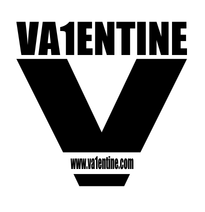
Ok, did a bonus one for you. It's monochrome (like the ones dines did), so you can change the color or invert the default color to suit your needs. This one is a professional logo (unlike the previous ones I made) so it can be put to use in prints,etc. Normally I would get paid for this, but what the heck

Enjoy

Image

 
Image

http://create-games.com/project.asp?id=1549

OMC

What a goofball

Registered
  21/05/2007
Points
  3516

KlikCast Musician! Guy with a HatSomewhat CrazyARGH SignLikes TDCHas Donated, Thank You!Retired Admin
30th January, 2009 at 15:38:48 -

So... how do you differentiate between professional and non-professional? You liked one better so you decided to call it professional?


Ski

TDC is my stress ball

Registered
  13/03/2005
Points
  10130

GOTW WINNER CUP 1!GOTW WINNER CUP 2!GOTW WINNER CUP 3!KlikCast HelperVIP MemberWii OwnerStrawberryPicture Me This Round 28 Winner!PS3 OwnerI am an April Fool
Candy Cane
30th January, 2009 at 15:46:05 -


Originally Posted by Mr Green
@Adam: I can quickly edit the logo to make it more readable, not that big of a deal actually.
@Mark: It could have been animated if I had done it in flash or 3dmaya

I did this that logo in a few hours and for free/fun so it's not the best of my designs but I think it can be edited to be included in various genres of games too

I'll try to make another version of the logo later on


EDIT: Here is a new one:

Image

It would suit for a lighter/softer background and the name is "readable".


Looks like a woman's tampon variety

 
n/a

Dr. James MD

Addict

Registered
  08/12/2003
Points
  11941

First GOTW AwardSecond GOTW AwardThird GOTW AwardPicture Me This -Round 26- Winner!
30th January, 2009 at 17:05:46 -

Originally Posted by Mr Green

Image

Is very ace.

 
Image
http://uk.youtube.com/watch?v=j--8iXVv2_U
On the sixth day God created Manchester
"You gotta get that sand out your vaj!" x13
www.bossbaddie.com

Mr G


Registered
  31/12/2008
Points
  178

VIP MemberPS3 OwnerI like Aliens!Attention GetterDos Rules!
30th January, 2009 at 18:54:16 -


Originally Posted by OldManClayton
So... how do you differentiate between professional and non-professional? You liked one better so you decided to call it professional?


My previous logos where not professional logos because they can only be used online and not on anykind of print that easily. I did spend some time on them too but it can't be mobile. While the last one I posted can be ported.

Professional logos mostly follow the general rules set forth by designers and can be made commercial.

These rules are simply:

- A simple logo giving a diverse message (it could be a simple cross like in American Cross, but it gives the message of aid/helping)
- Least amount of colors (for ease in printing and resizing it could be just black and white or about 5 colors the most)
- Vivid image of the logo (despite the size of the complete design, it should be viewable and discreet even on a bussiness card)

Basically if you see a logo design and it shows the whole message of the entreprenuer (might have miss-spelled it)and it's visible , then it's a professional logo design and it's an accurate logo design. Just go to google and image search "game developer logos" to see examples for what I'm saying

 
Image

http://create-games.com/project.asp?id=1549

Mr G


Registered
  31/12/2008
Points
  178

VIP MemberPS3 OwnerI like Aliens!Attention GetterDos Rules!
30th January, 2009 at 18:57:53 -


Originally Posted by -Adam-

Originally Posted by Mr Green
@Adam: I can quickly edit the logo to make it more readable, not that big of a deal actually.
@Mark: It could have been animated if I had done it in flash or 3dmaya

I did this that logo in a few hours and for free/fun so it's not the best of my designs but I think it can be edited to be included in various genres of games too

I'll try to make another version of the logo later on


EDIT: Here is a new one:

Image

It would suit for a lighter/softer background and the name is "readable".


Looks like a woman's tampon variety


LOL, yeah I guess it does look like a tampon variety But still I like the colors

 
Image

http://create-games.com/project.asp?id=1549

-Liam-

Cake Addict

Registered
  06/12/2008
Points
  556

Wii OwnerIt's-a me, Mario!Hero of TimeStrawberry
30th January, 2009 at 19:00:51 -

Image

 
Image

Tell 'em Babs is 'ere...

Ski

TDC is my stress ball

Registered
  13/03/2005
Points
  10130

GOTW WINNER CUP 1!GOTW WINNER CUP 2!GOTW WINNER CUP 3!KlikCast HelperVIP MemberWii OwnerStrawberryPicture Me This Round 28 Winner!PS3 OwnerI am an April Fool
Candy Cane
30th January, 2009 at 19:02:18 -

Best entry so far, keep them coming, Liam.

 
n/a

W3R3W00F

Drum and Bass Fueled Psycho

Registered
  08/11/2008
Points
  370

VIP MemberCardboard BoxThe Cake is a Lie
30th January, 2009 at 19:06:19 -

It's amazing. *sniff*

 
n/a

Mr G


Registered
  31/12/2008
Points
  178

VIP MemberPS3 OwnerI like Aliens!Attention GetterDos Rules!
30th January, 2009 at 20:31:04 -

I was going to edit my last logo post but was unable to edit. So I'll post various versions of my last logo here

Image

 
Image

http://create-games.com/project.asp?id=1549

Marko

I like you You like you

Registered
  08/05/2008
Points
  2804

Has Donated, Thank You!Game of the Week WinnerVIP Member360 OwnerDos Rules!Happy FellahCrazy EvilI am an April FoolGingerbread House
30th January, 2009 at 20:46:12 -

Mr Green does it again! I think i like all of yours the best!

 
Image

Subliminal Dreams. . ., daily gaming news and the home of Mooneyman Studios!
www.mooneyman-studios.webs.com

Ski

TDC is my stress ball

Registered
  13/03/2005
Points
  10130

GOTW WINNER CUP 1!GOTW WINNER CUP 2!GOTW WINNER CUP 3!KlikCast HelperVIP MemberWii OwnerStrawberryPicture Me This Round 28 Winner!PS3 OwnerI am an April Fool
Candy Cane
30th January, 2009 at 21:08:28 -

I don't like them at all.

 
n/a

Mr G


Registered
  31/12/2008
Points
  178

VIP MemberPS3 OwnerI like Aliens!Attention GetterDos Rules!
30th January, 2009 at 21:11:59 -

You may or may not like them, everyone's taste differs. But at least say why you don't like them perhaps?

 
Image

http://create-games.com/project.asp?id=1549

Ski

TDC is my stress ball

Registered
  13/03/2005
Points
  10130

GOTW WINNER CUP 1!GOTW WINNER CUP 2!GOTW WINNER CUP 3!KlikCast HelperVIP MemberWii OwnerStrawberryPicture Me This Round 28 Winner!PS3 OwnerI am an April Fool
Candy Cane
30th January, 2009 at 21:15:43 -

Looks too extreme-sports, word, word.

 
n/a

DeadmanDines

Best Article Writer

Registered
  27/04/2006
Points
  4758
30th January, 2009 at 23:22:22 -

It's really good, the only question I would have is if it's quite the right kind of style? It all depends on Va1entine's thoughts at the end of the day, but perhaps it's too 'rage'-esque, too 'Beast Wars'? One thing I noticed with Va1entine's original design was that it was quite neutral, it didn't seem to come with any real hints as to flavour.

It's tricky, though, cos on the one hand it's a good idea to stick with the spirit of their original suggestion/situation. But on the other hand, something different may be the spark of inspiration they need to define a new image.

Swings and roundabouts I guess, it'll just be nice to know which one he eventually picks

Where are you, Va1entine!!

 
191 / 9999 * 7 + 191 * 7

OMC

What a goofball

Registered
  21/05/2007
Points
  3516

KlikCast Musician! Guy with a HatSomewhat CrazyARGH SignLikes TDCHas Donated, Thank You!Retired Admin
31st January, 2009 at 00:31:18 -

They look ok, but I never liked the scraggly paint-stroke look. It's overused I think, and kind of plain. I should be experimenting with more ideas so I can get better at logo making, but I'm too lazy right now. That and my computer freezes often.

You know, occasionally I think it would be fun to go to school to be a graphic designer.


Jon Lambert

Administrator
Vaporware Master

Registered
  19/12/2004
Points
  8235

VIP MemberWii OwnerTDC Chat Super UserI am an April FoolSSBB 3265-4741-0937ACCF 3051-1173-8012360 Owner
31st January, 2009 at 03:11:02 -

Okay, to make sure no one thinks I made up the fact that I made 6 logos, I quickly whipped up these two from my sketches. I also sketched 5 more, so there's 11.
Image
This one, I tried to incorporate part of your avatar into the logo, but I remembered it wrong.
Image
This one was arbitrary, as were 8 others not here.

Anyone else can HD-ify them if they want, but I didn't have time to. On Wednesday, my dad wouldn't let me use the computer, and I had to do homework yesterday.

 
Sandwich Time!Whoo!

JoyCheck & KeyCheck Widgets
For easy implementation of customizable joystick and keyboard controls.
http://www.create-games.com/download.asp?id=8364

Silveraura

God's God

Registered
  08/08/2002
Points
  6747

Game of the Week WinnerKlikCast StarAlien In Training!VIP Member360 OwnerWii OwnerSonic SpeedThe Cake is a LieComputerChristmas Tree!
I am an April Fool
31st January, 2009 at 04:57:49 -


Originally Posted by -Adam-
I don't like them at all.


I don't think your opinion counts at all here, Adam. Sorry.

 
http://www.facebook.com/truediamondgame

Ski

TDC is my stress ball

Registered
  13/03/2005
Points
  10130

GOTW WINNER CUP 1!GOTW WINNER CUP 2!GOTW WINNER CUP 3!KlikCast HelperVIP MemberWii OwnerStrawberryPicture Me This Round 28 Winner!PS3 OwnerI am an April Fool
Candy Cane
31st January, 2009 at 05:00:58 -

Brandon I love how you go around fishing through the threads to find my comments and make your own comments on them yourself. Get a life, or better still- work on your online game I doubt we'll ever see

 
n/a

Mr G


Registered
  31/12/2008
Points
  178

VIP MemberPS3 OwnerI like Aliens!Attention GetterDos Rules!
31st January, 2009 at 08:59:38 -

Ok, for the ones who didn't like it I went for the neutral/classical style that is like Va1entine's default logo:

Image


But we still haven't heard a word from Va1entine yet...

 
Image

http://create-games.com/project.asp?id=1549

Klikmaster

Master of all things Klik

Registered
  08/07/2002
Points
  2599

Has Donated, Thank You!You've Been Circy'd!VIP MemberPS3 Owner
31st January, 2009 at 12:07:08 -

I think Va1entine already has a great selection of logos to choose from!

 
n/a

chrilley

Insane Beaver

Registered
  05/01/2002
Points
  704

Game of the Week WinnerVIP Member360 Owner
31st January, 2009 at 12:42:32 -

So do I.

 
Image

Marko

I like you You like you

Registered
  08/05/2008
Points
  2804

Has Donated, Thank You!Game of the Week WinnerVIP Member360 OwnerDos Rules!Happy FellahCrazy EvilI am an April FoolGingerbread House
31st January, 2009 at 13:17:24 -

Not a fan of that last selection Mr Green - you dumbed your style down too much! I think your other designs kick ass though!

 
Image

Subliminal Dreams. . ., daily gaming news and the home of Mooneyman Studios!
www.mooneyman-studios.webs.com

Mr G


Registered
  31/12/2008
Points
  178

VIP MemberPS3 OwnerI like Aliens!Attention GetterDos Rules!
31st January, 2009 at 14:44:08 -

It's Va1entine's choice to choose any of the designs, so it doesn't matter how it looks...

 
Image

http://create-games.com/project.asp?id=1549

Spitznagl

Cabinetmaker

Registered
  06/12/2008
Points
  4260

The SpinsterVIP MemberHas Donated, Thank You!Picture Me This Round 29 Winner!Picture Me This Round 31 Winner!Picture Me This Round 36 Winner!
31st January, 2009 at 15:51:43 -

I tried just for fun.

Image
The original might be to big for what you want to use it for, so it is resized here.
Image

Color variance
Image
Image


Edited by Spitznagl

 
...

Ski

TDC is my stress ball

Registered
  13/03/2005
Points
  10130

GOTW WINNER CUP 1!GOTW WINNER CUP 2!GOTW WINNER CUP 3!KlikCast HelperVIP MemberWii OwnerStrawberryPicture Me This Round 28 Winner!PS3 OwnerI am an April Fool
Candy Cane
31st January, 2009 at 15:57:34 -

That typography is kinda hard to read >_<

 
n/a

W3R3W00F

Drum and Bass Fueled Psycho

Registered
  08/11/2008
Points
  370

VIP MemberCardboard BoxThe Cake is a Lie
31st January, 2009 at 16:00:29 -

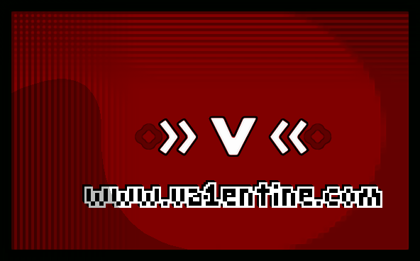
I like the top red one's design, however I'm not very wowed about the two arrows pointing to the V, in front of a rounded star, ball thing. Plus, I think the text is just too hard to read.

 
n/a

W3R3W00F

Drum and Bass Fueled Psycho

Registered
  08/11/2008
Points
  370

VIP MemberCardboard BoxThe Cake is a Lie
31st January, 2009 at 17:00:12 -

TDC needs a *rolls eyes* Emoticon. -¸-

 
n/a

Spitznagl

Cabinetmaker

Registered
  06/12/2008
Points
  4260

The SpinsterVIP MemberHas Donated, Thank You!Picture Me This Round 29 Winner!Picture Me This Round 31 Winner!Picture Me This Round 36 Winner!
1st February, 2009 at 00:23:17 -

What?
You mean Black on white isn't visible enought?

 
...

W3R3W00F

Drum and Bass Fueled Psycho

Registered
  08/11/2008
Points
  370

VIP MemberCardboard BoxThe Cake is a Lie
1st February, 2009 at 00:28:13 -

Well it's, sure enough, see-able, but It's readability is a different story.

 
n/a

Dr. James MD

Addict

Registered
  08/12/2003
Points
  11941

First GOTW AwardSecond GOTW AwardThird GOTW AwardPicture Me This -Round 26- Winner!
1st February, 2009 at 00:43:56 -


Originally Posted by spitznagl
What?
You mean Black on white isn't visible enought?


The problem is that there is a lot of black and white.
The V itself is very clear and I like the colours and look of the red/green one.

 
Image
http://uk.youtube.com/watch?v=j--8iXVv2_U
On the sixth day God created Manchester
"You gotta get that sand out your vaj!" x13
www.bossbaddie.com

Klikmaster

Master of all things Klik

Registered
  08/07/2002
Points
  2599

Has Donated, Thank You!You've Been Circy'd!VIP MemberPS3 Owner
1st February, 2009 at 17:53:56 -

What spitznagl has done looks more than a logo. It is more like a logo that has been used on a banner or something.

 
n/a

OMC

What a goofball

Registered
  21/05/2007
Points
  3516

KlikCast Musician! Guy with a HatSomewhat CrazyARGH SignLikes TDCHas Donated, Thank You!Retired Admin
1st February, 2009 at 19:34:44 -

The busyness of it hurts my eyes. (Yes, I meant Busyness.)


Ski

TDC is my stress ball

Registered
  13/03/2005
Points
  10130

GOTW WINNER CUP 1!GOTW WINNER CUP 2!GOTW WINNER CUP 3!KlikCast HelperVIP MemberWii OwnerStrawberryPicture Me This Round 28 Winner!PS3 OwnerI am an April Fool
Candy Cane
1st February, 2009 at 19:37:36 -

It's just too random IMO.

 
n/a

alastair john jack

BANNED

Registered
  01/10/2004
Points
  294

GOTW WINNER CUP 1!GOTW WINNER CUP 2!GOTW WINNER CUP 3!VIP MemberMushroomI am an April Fool
3rd February, 2009 at 08:00:05 -

Seriously guys, you all failed at this.
Only mine is good!
Image

Edited by alastair john jack

 
lol

DeadmanDines

Best Article Writer

Registered
  27/04/2006
Points
  4758
3rd February, 2009 at 10:58:10 -

NOOOO!!! Yellow and Cyan, why didn't I think of that!!?!!

I'm gonna go sulk, I could have done with that £15

 
191 / 9999 * 7 + 191 * 7

Mr G


Registered
  31/12/2008
Points
  178

VIP MemberPS3 OwnerI like Aliens!Attention GetterDos Rules!
3rd February, 2009 at 16:23:38 -

That color choice can't be the best

 
Image

http://create-games.com/project.asp?id=1549

alastair john jack

BANNED

Registered
  01/10/2004
Points
  294

GOTW WINNER CUP 1!GOTW WINNER CUP 2!GOTW WINNER CUP 3!VIP MemberMushroomI am an April Fool
6th February, 2009 at 08:09:17 -

Think I'm getting better!

Image

Edited by alastair john jack

 
lol

-Dark Martin-

The dark is most certainly not your friend

Registered
  05/06/2008
Points
  21

Has Donated, Thank You!KlikCast StarSonic SpeedWii Owner360 Owner
6th February, 2009 at 13:30:58 -

£15... i could buy Sonic Unleashed with that...

Damn i need a graphics pad.><

 
<a href="http://s50.photobucket.com/albums/f315/Martin_Bodger/?action=view¤t=signature_stripcopy.png" target="_blank">Image

Chaoz (Tri-Life Gaming)


Registered
  29/07/2005
Points
  11

VIP MemberAttention GetterWii Owner
8th February, 2009 at 21:46:29 -

I was bored, so here's mine. i kinda stole alspal's style, some of the stuff i saw in this thread, and put 'em in a big ol' blender.
Image

"A blender, or liquidiser in British English, is a kitchen appliance used to mix ingredients or puree food." - Wikipedia

Edited by Chaoz (Tri-Life Gaming)

 
n/a

DeadmanDines

Best Article Writer

Registered
  27/04/2006
Points
  4758
10th February, 2009 at 10:04:01 -

Here's my latest attempt; by the way, where IS Va1entine?

Image

 
191 / 9999 * 7 + 191 * 7

Klikmaster

Master of all things Klik

Registered
  08/07/2002
Points
  2599

Has Donated, Thank You!You've Been Circy'd!VIP MemberPS3 Owner
10th February, 2009 at 12:30:08 -

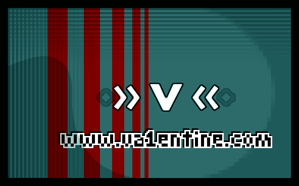
Chaoz, the V is a bit wierd but I like the rounded square with the website address.
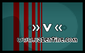
Dines, interesting but the website address looks very squashed horizontally.

 
n/a

OMC

What a goofball

Registered
  21/05/2007
Points
  3516

KlikCast Musician! Guy with a HatSomewhat CrazyARGH SignLikes TDCHas Donated, Thank You!Retired Admin
10th February, 2009 at 13:19:25 -

Alspal-- You. Are a goober.


Mr G


Registered
  31/12/2008
Points
  178

VIP MemberPS3 OwnerI like Aliens!Attention GetterDos Rules!
10th February, 2009 at 13:46:51 -

Va1entine hasn't been online for a while I guess...

He might even have forgotten about this thread

 
Image

http://create-games.com/project.asp?id=1549

Va1entine


Registered
  14/12/2003
Points
  367

Has Donated, Thank You!360 Owner
19th February, 2009 at 21:59:52 -

Nope not forgotten, playing to much Gears of war 2 is the problem... well that and a full time job! Some great response's to my add and i have some favorites. Not seen one i'd like to change my logo too unfortunately though! Still this just shows TDC has a very creative community and i never want to see this site disapear! I'll definitely be making another donation to the site soon!!!!!

PS: If anyone still wants to design a logo and i use it my offer still stands!!!!!!!

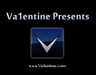
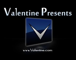
(by the way, black backround and blue logo and white writeing is what i'm looking for )

Edited by Va1entine

 
n/a

Mr G


Registered
  31/12/2008
Points
  178

VIP MemberPS3 OwnerI like Aliens!Attention GetterDos Rules!
20th February, 2009 at 11:57:40 -

I'll try to make something when I'm free

 
Image

http://create-games.com/project.asp?id=1549
   

Post Reply


Advertisement

Worth A Click